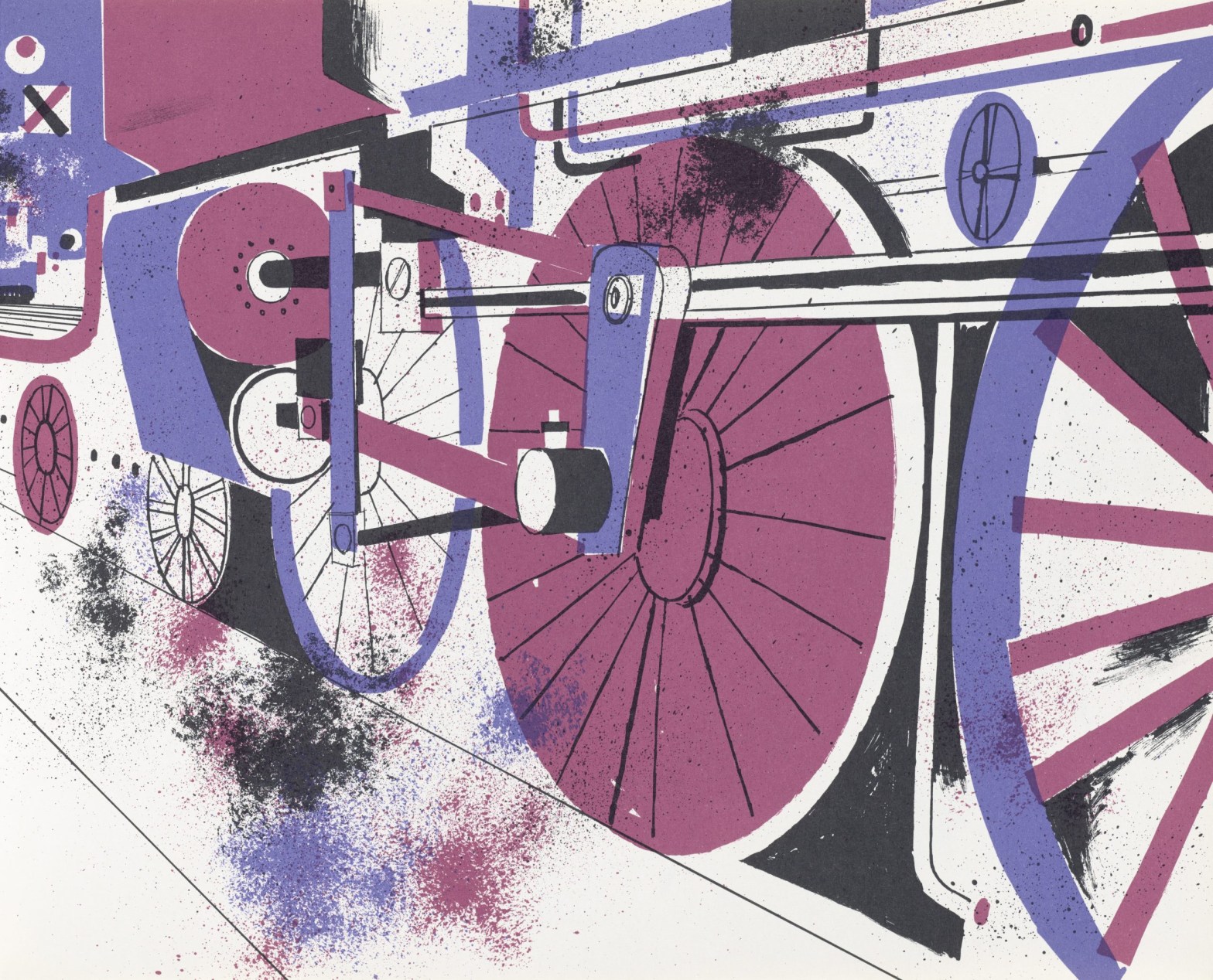
If you are traveling to Munich, a must-see is the Die Neue Sammlung — which is currently showcasing Paula Scher’s major retrospective — and curator Caroline Fuchs’ Where the Wild Lines Are, an investigation into the museum’s founding nearly 100 years ago. The latter exhibition is not, as one might expect, dedicated to posters, but is instead inspired by the museum’s Toys and Picture Books 1927; last summer Fuchs took a closer look at the institution’s collection of picture books, and discovered a trove of stunning first editions.
There are many familiar books on view, and rare discoveries as well. The overarching goal was to show through design and illustration how the industry has evolved from past and present.
Below, Fuchs tells us more about how the exhibition came about.

How long has the Die Neue Sammlung been collecting children’s books, and what was the motivation?
The motivation for this part of the collection lies in the founding idea of the museum. Die Neue Sammlung was founded as a museum dedicated to collecting industrial design with two main focuses: Firstly, contemporary design was to be collected and, secondly, internationally. The aim of this collection policy was, on the one hand, to be able to show designers of the time a collection of outstanding examples and, on the other hand, to give the public the opportunity to select good design for their own needs. It was an explicit aim to show affordable good design in particular. The 1927 exhibition, which showed picture books and toys from many different countries, combined both objectives of the newly founded museum.

How many books are in the show?
The exhibition shows around 180 books, a selection from the museum’s collection of around 750 children’s books.
The oldest children’s book in the collection is a volume of the Münchener Bilderbücher (Munich Picturebooks) from around 1870, one of a 23-volume series of picture books illustrated with hand-colored wood engravings, and thus one of the few books that were not produced by machine. The focus of the exhibition begins at the turn of the 18th and 19th centuries, i.e., at the time when the children’s book developed from an educational book into a medium dedicated to leisure.

What criteria did you use for inclusion in the exhibit?
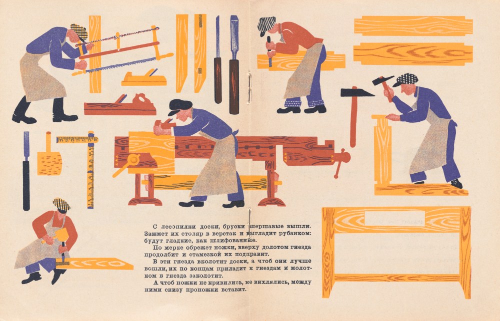
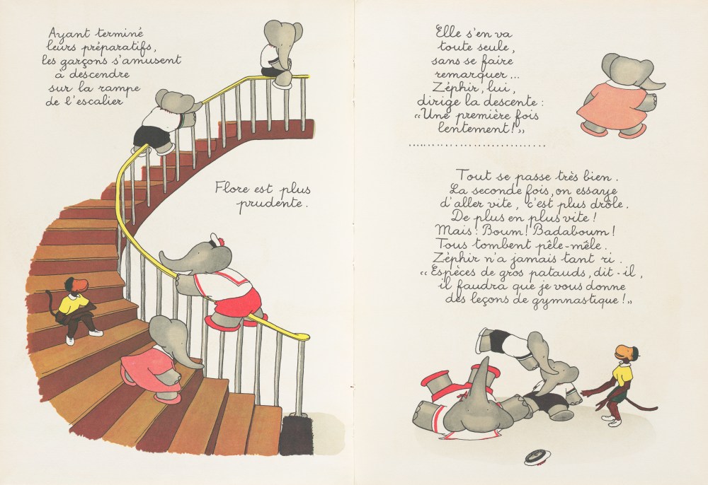
For us as a design museum, the design of the picture books is at the center of our interest. How a book was illustrated, set and realized determined the selection, not the story it tells. Outstanding early examples of picture book design are, for example, the children’s books by Lothar Meggendorfer from the end of the 19th century. Although they are books on the outside, they contain entire worlds of play between the covers. With their ingenious folding and pulling mechanisms, they can be transformed into three-dimensional worlds that can be used as play backdrops. One example is the doll’s house from around 1889, which hides five different living rooms between the two book covers that can be placed next to each other.
The exhibit is organized in various ways: chronologically, thematically and technically. What was the thinking behind this process?
The exhibition aims to achieve two goals: On the one hand, it wants to show the museum’s own collection of picture books, which has not been exhibited since 1960. The chronological part of the exhibition, which shows the development of international children’s books from around 1900 to the present day, is primarily intended for this purpose. On the other hand, the show focuses specifically on the design of children’s books. To achieve this, the second part of the exhibition sorts the books according to four different design criteria that are characteristic features of them.
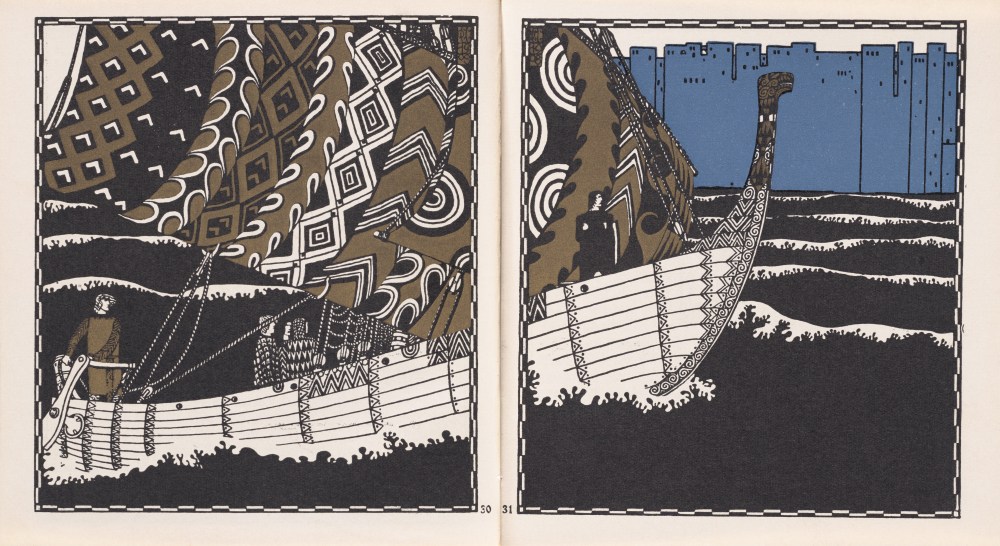
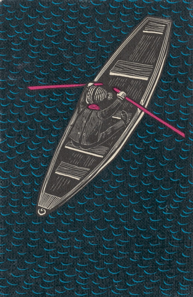
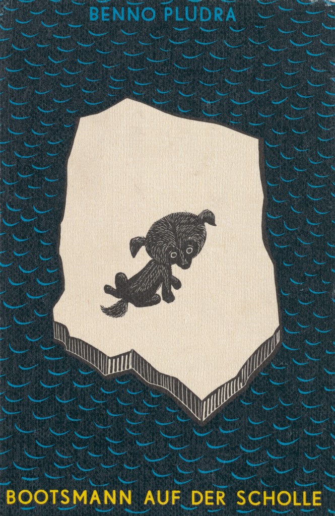
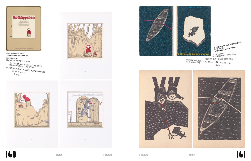
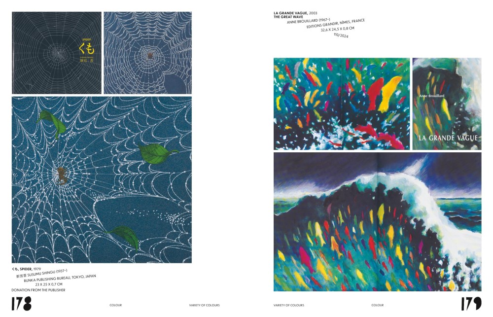
The first is color. Since the beginning of the 20th century, the majority of children’s books have been designed in color. The selection and limitation of colors is therefore in almost all cases not an economic but a design decision. The juxtaposition of black-and-white books and books that use only a few or special colors asks about the reasons and spaces of experience that result from the deliberate omission of colors or their special selection.
The second design category is perspective. Due to their height alone, children have a different view of the world to many adults. Changes of perspective are therefore celebrated in many picture books, whether the life of particularly small or particularly large creatures is the subject or we are shown the world in close up or from a bird’s-eye view.
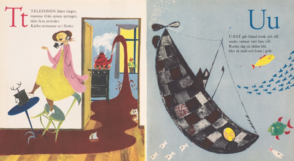
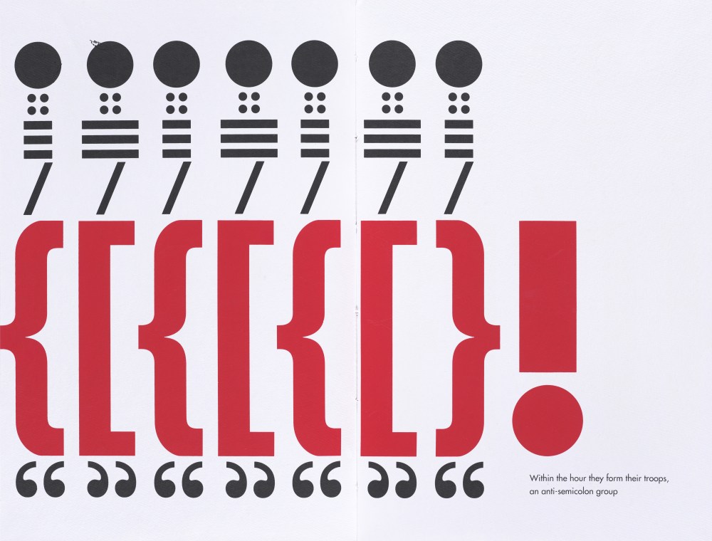
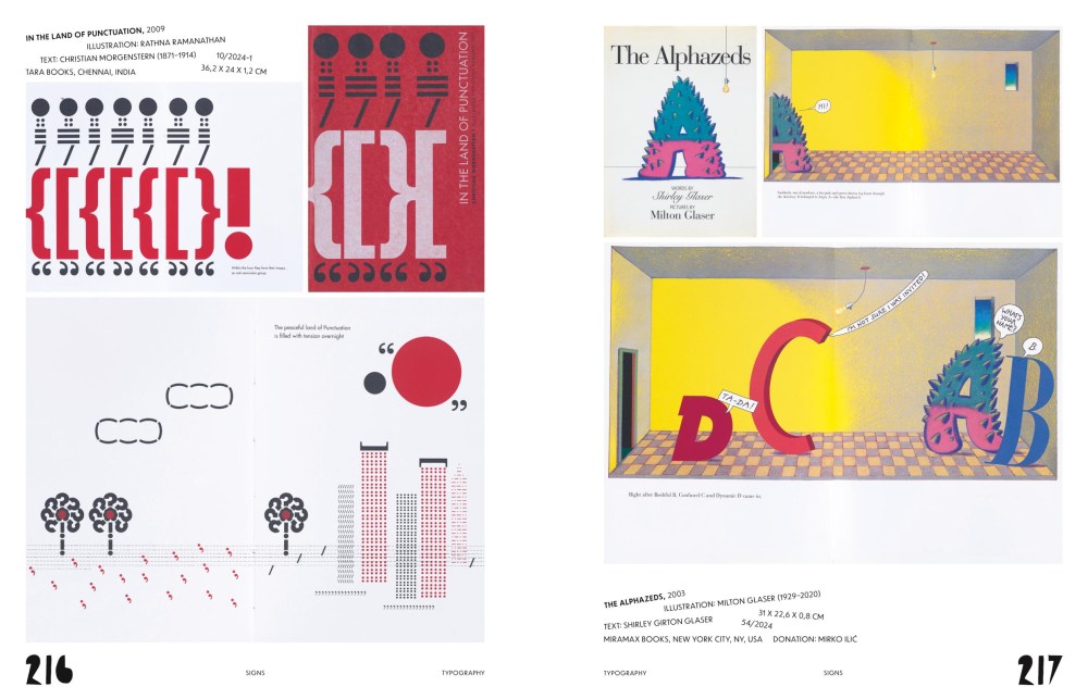
The third category is dedicated to signs and shapes. The focus here is on characters and numbers, but also on shapes that can be used to tell a whole story. ABC books demonstrate the play with letter shapes and phonetic and semantic associations. Warja Lavater-Honegger tells the entire Little Red Riding Hood story using circles alone, while Sven Völker creates ever new animal worlds from the keys of a piano. Entire worlds can be created with a very limited range of visual vocabulary.
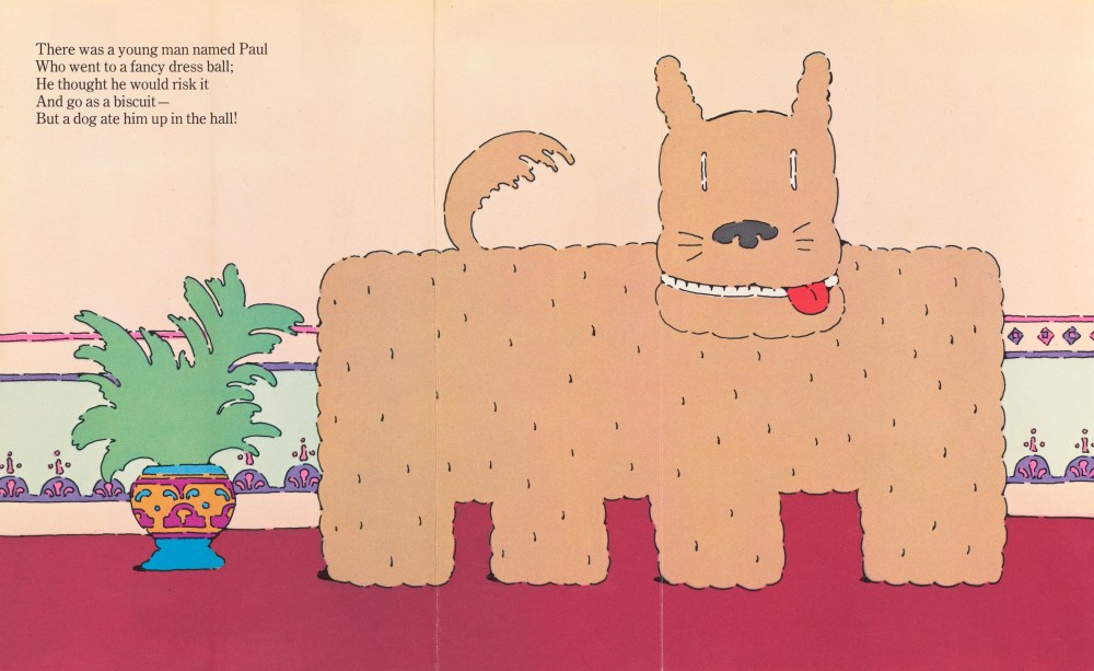
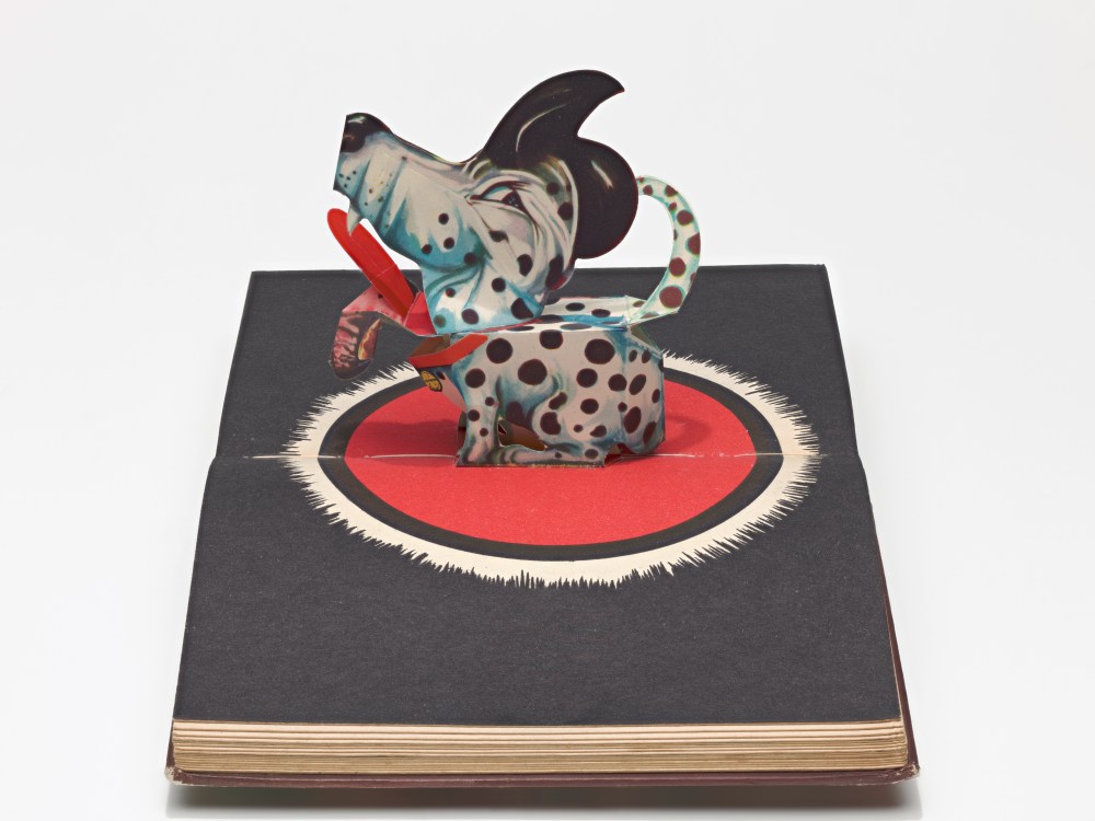
The fourth category brings together all kinds of picture books that open up into the third dimension, i.e., pop-up books, fold-out books and books whose pages have holes and allow you to see through them. Here, for example, Seymour Chwast’s Limerickricks can be seen, in which the art can be observed of how one form can be completely transformed into another through expansion, which is nevertheless convincing in terms of color and contour.
What did you learn from curating the material? And what do you hope visitors (old and young) will take away?
I hope that visitors will enjoy discovering the creative diversity of picture books and discover them as a medium of excellent design. Throughout the ages and across different countries, picture books have been a field of artistic innovation and creative experimentation. The vitality of this genre stems from its existence as a special branch of the book, in which imagination and the joy of experimentation are more important than in other areas of book production. It is no coincidence that famous graphic designers have repeatedly turned to children’s books in order to be able to work completely freely without a client. At the same time, there were already children’s book designers in the middle of the 20th century who have dedicated themselves entirely to this genre, and there are others now. They usually create both text and images themselves and have a great influence in their era. One realization that I was particularly delighted about when preparing the exhibition was the fact that in recent years there have been new startups of small publishing houses all over the world that have dedicated themselves entirely to the special picture book. They enable a current diversity and quality in picture books, in the diversity of the current digital range of media, to provide a bridge for a new golden age of children’s books.
If I may add some information on the exhibition design: The exhibition architecture is designed to allow people of all ages and abilities to be able to see the books. Exhibition architect Carina Deuschl designed houses for the books so that they can be presented vertically instead of horizontally. They replicate the joy of opening a book and finding new worlds between its covers. While the books in the museum collection have to be presented behind glass, 50 duplicates of the books exhibited were acquired secondhand. They allow visitors to explore the books haptically and in their entirety.
Christoph Niemann created the drawings in the exhibition space [specifically] for the show. He takes up the title of the exhibition (itself an allusion to Maurice Sendak’s famous children’s book) and presents fantastic creatures whose form is characterized by a playful juxtaposition of lines and color fields.
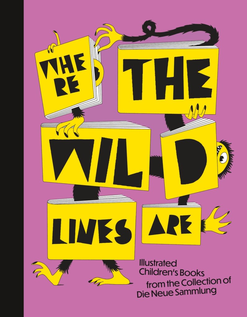
The catalog is a further treat:
All photos courtesy Die Neue Sammlung—The Design Museum.
