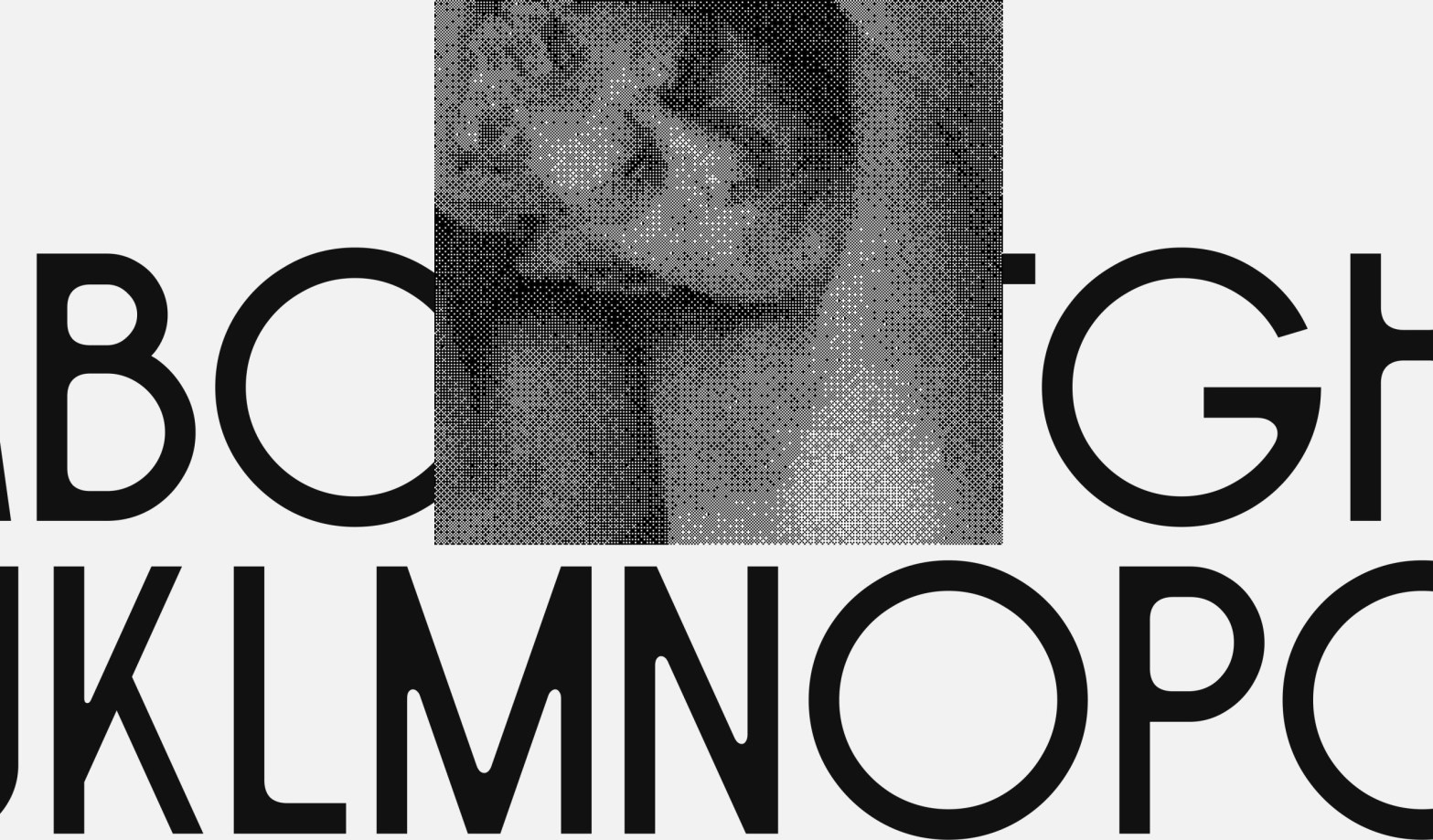
Penelope’s distinctive rhythm instantly caught my eye, vacillating between narrow and wide. Designed by Lyon-based Timothée Berger, the display typeface’s streamlined, imposing letterforms evoke Art Deco, while slight irregularities and sinuous joints give it an Art Nouveau vibe.

Berger, an independent interactive designer specializing in immersive web experiences for clients in the arts and culture space, has always enjoyed exploring different disciplines to bring into his creative practice. When he discovered typography, he began conceptualizing typefaces as they might come to life across media.
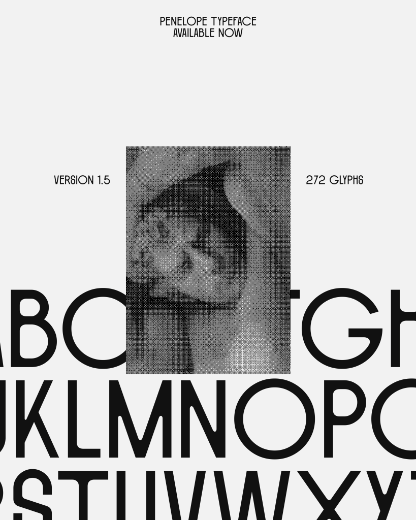
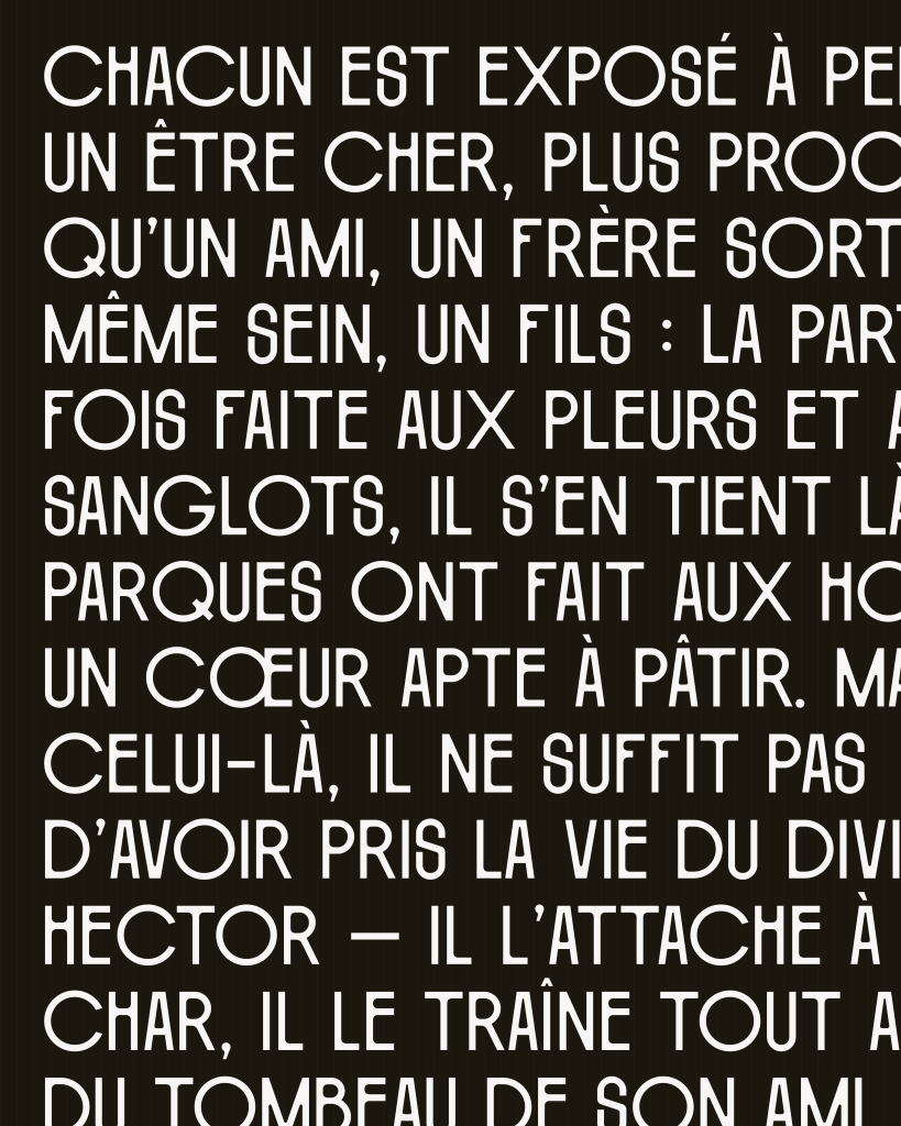
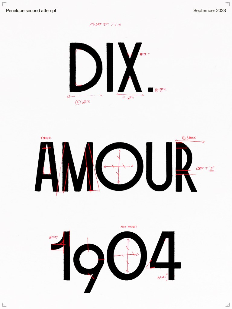
Penelope is the result of two years of work “of trying to find the perfect fit,” and Berger says there’s more work to do and is already planning an update for 2025. Even so, the typeface comes with 11 stylistic sets, 25 ligatures, and 272 glyphs, giving it versatility across languages and different use cases.
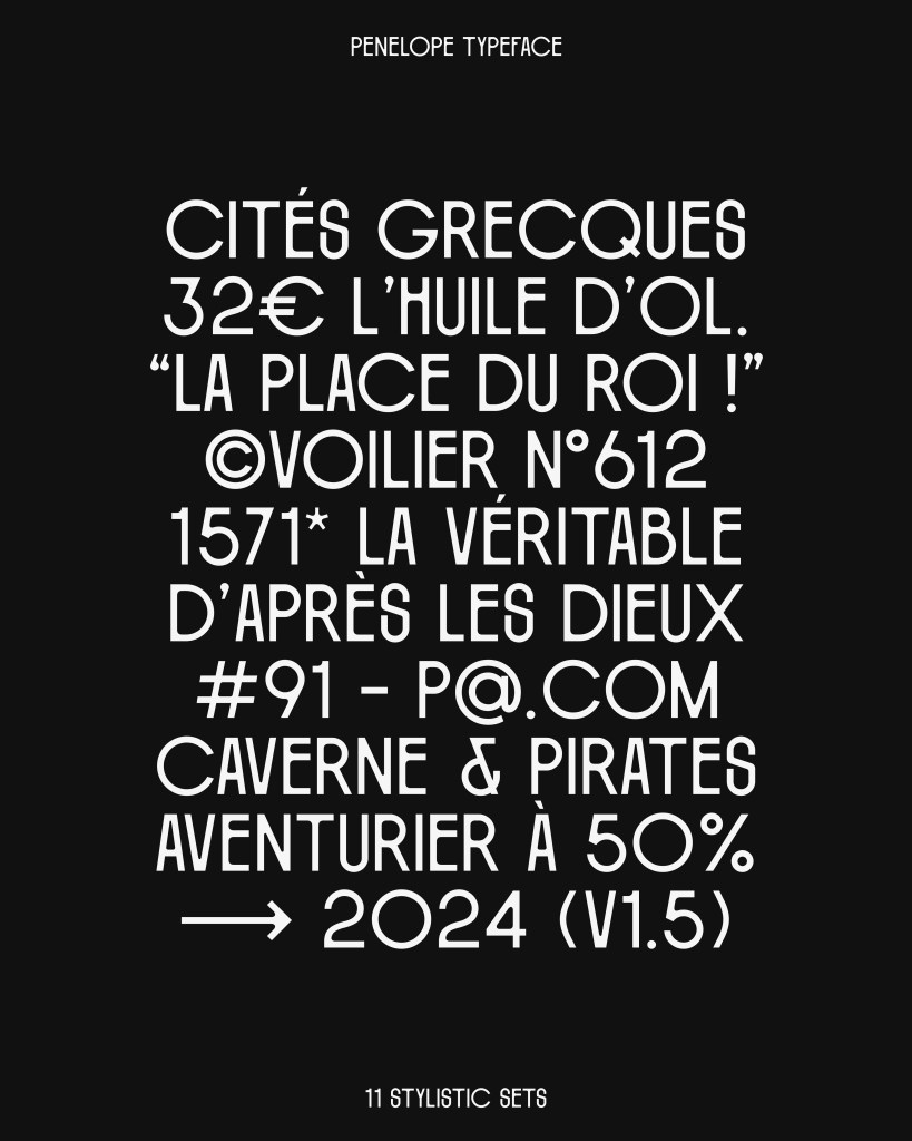
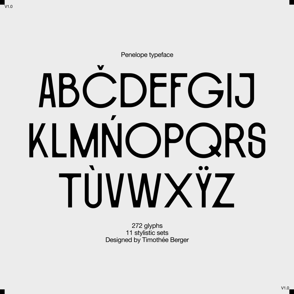
Given all the controversy around the Paris Summer Olympics logo, I think Penelope would have been a delightful typeface alternative for the wordmark.
Learn more about Timothée Berger on his Instagram and give Penelope a try.
