As a self-proclaimed color obsessive, every December, I wait with bated breath for Pantone’s Color of the Year announcement. I love color and its ability to influence emotions, style, and culture, and I’m fascinated by the research and cultural trend analysis that goes into selecting a shade. It’s not just about aesthetics; it’s about understanding the moment we’re living in and the stories we want to tell.
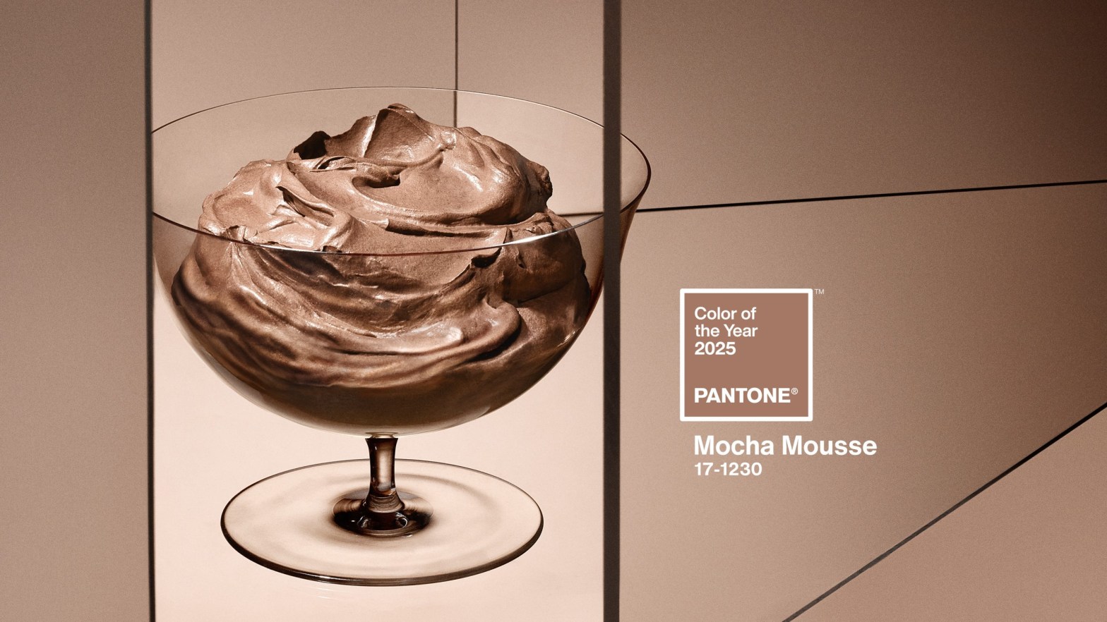
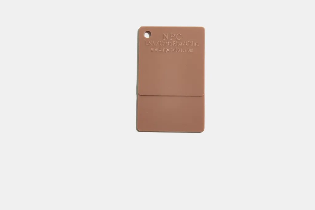
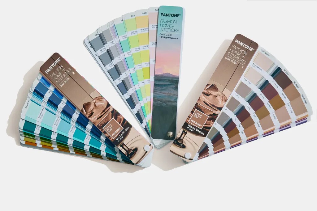
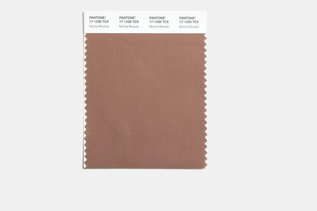
Always curious about how color reflects culture, Pantone’s Color of the Year 2025 is PANTONE 17-1230 Mocha Mousse, which offers plenty to unpack. A rich, earthy brown, it’s positioned as a color that balances sophistication and comfort. But does it capture the mood of the moment?
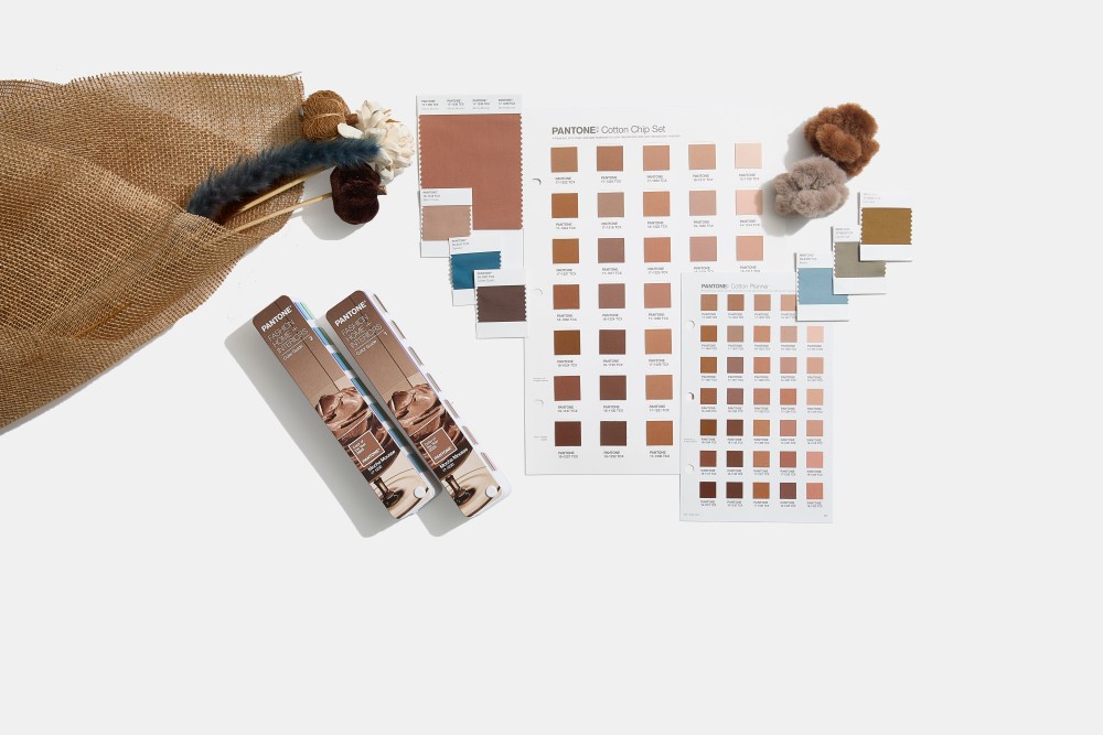
This year, much of the design world has been focused on themes of sustainability, simplicity, and connection. Mocha Mousse seeks to tap into those ideas, evoking warmth and stability. It’s a grounded shade that nods to nature and the pleasures of everyday life—a safe choice, perhaps, but also a versatile one.
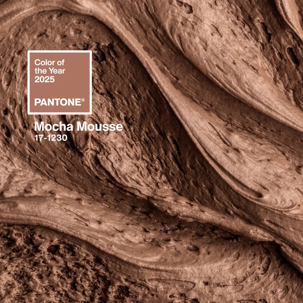

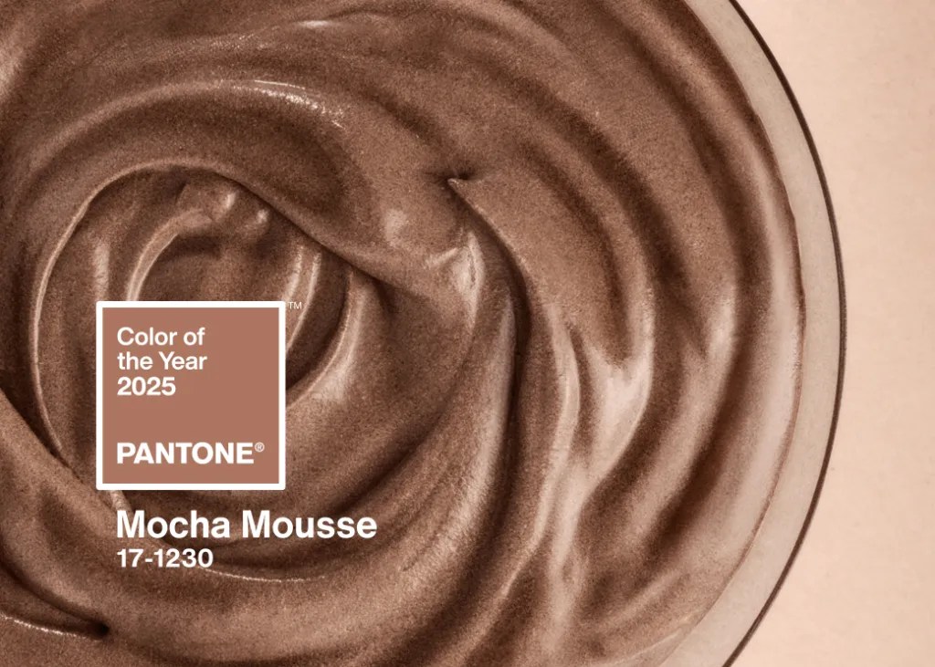
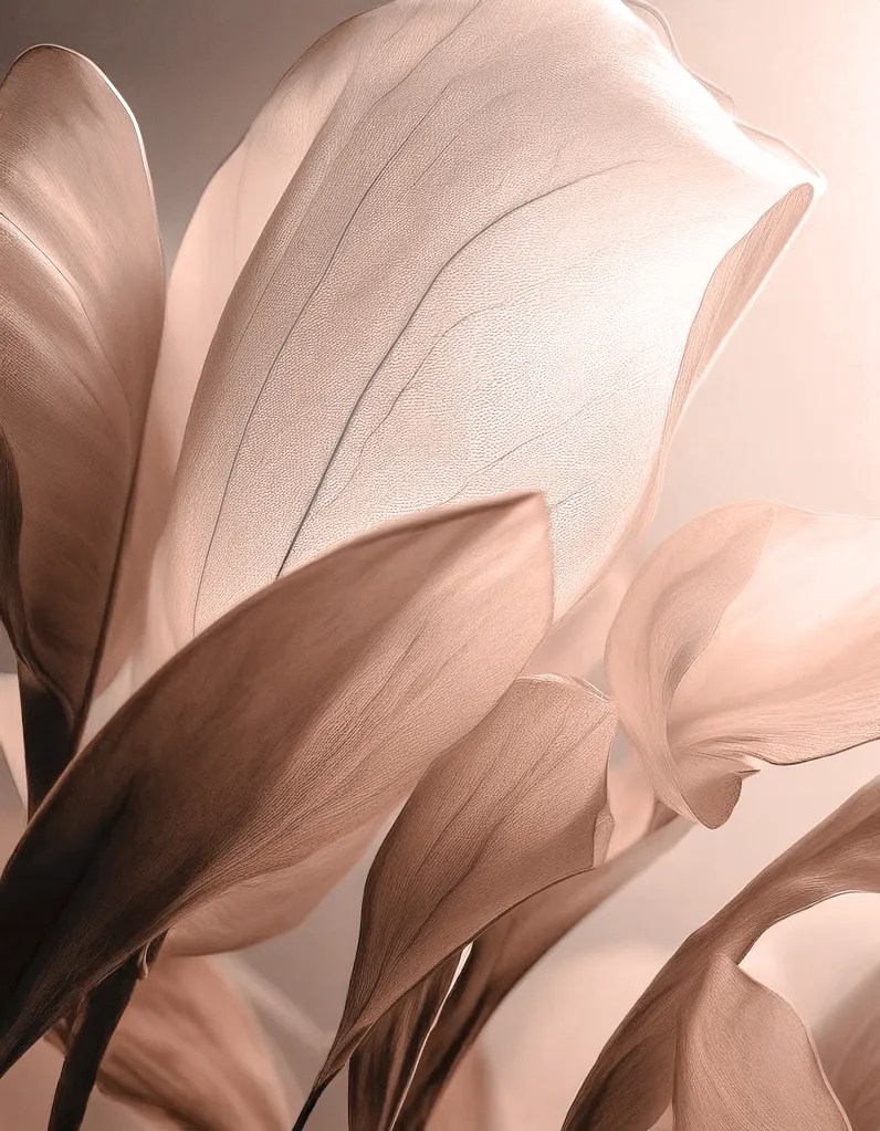
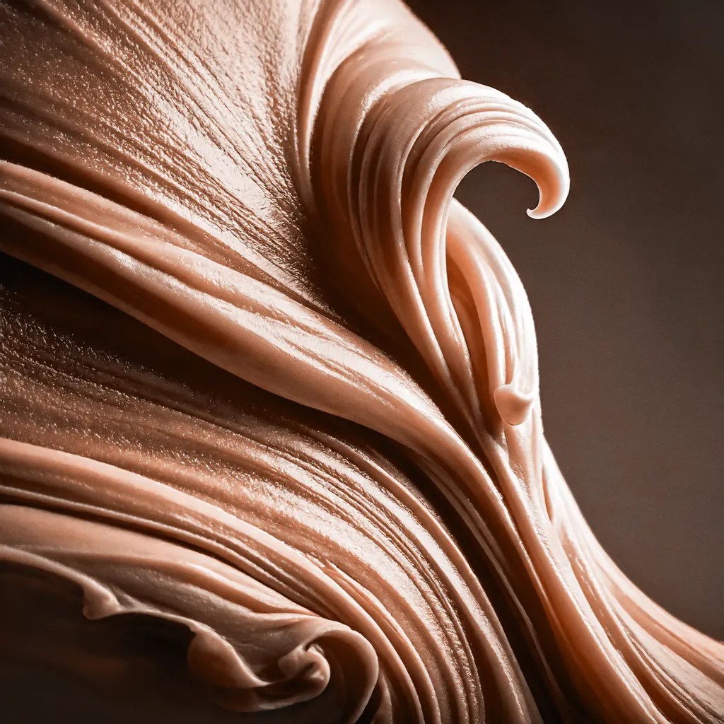
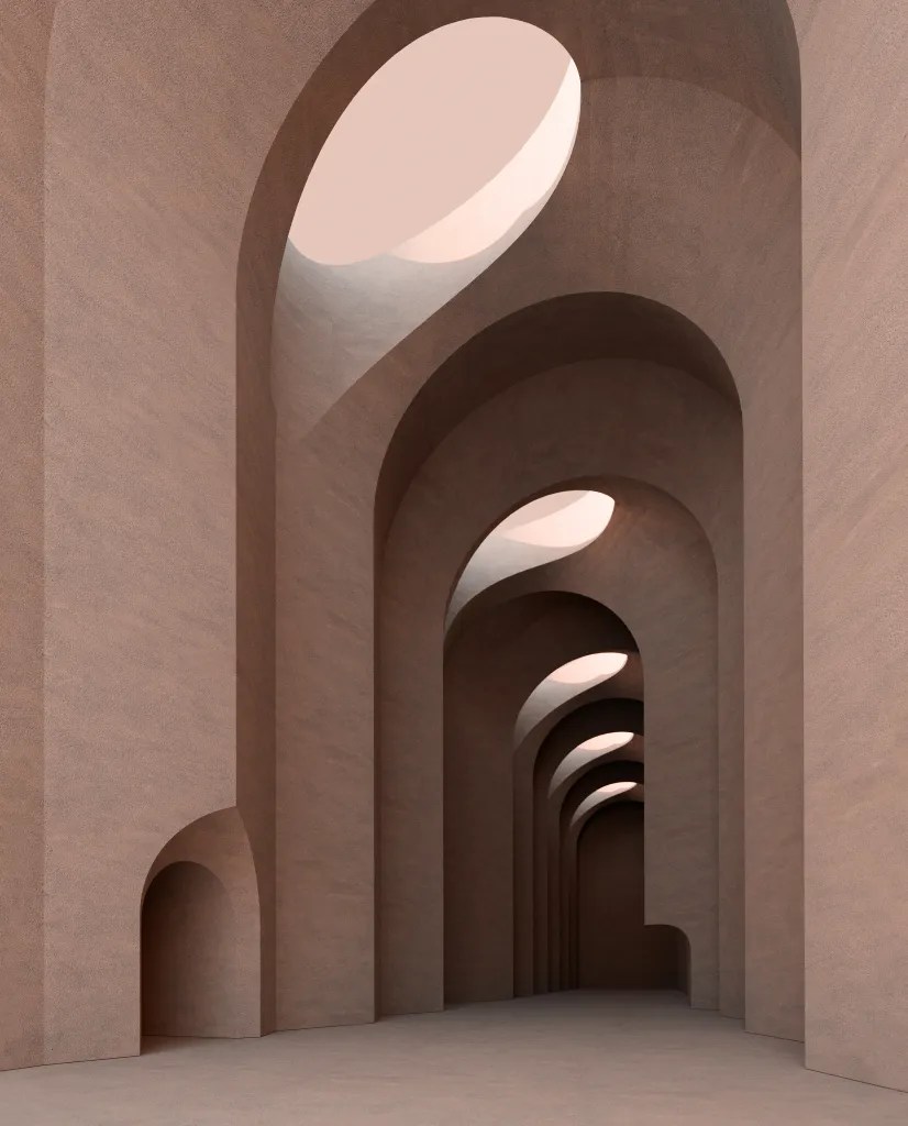
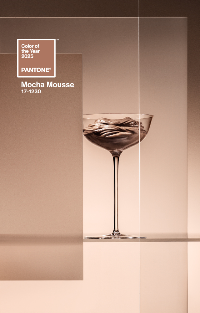
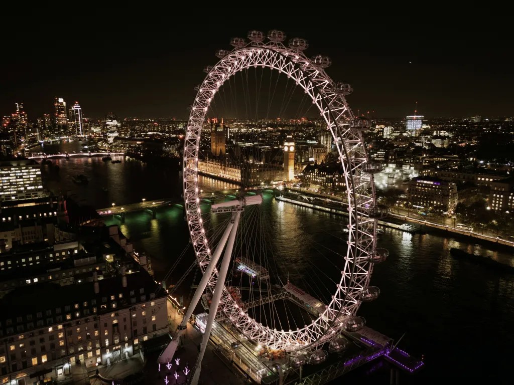
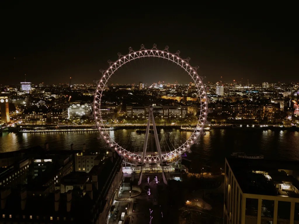
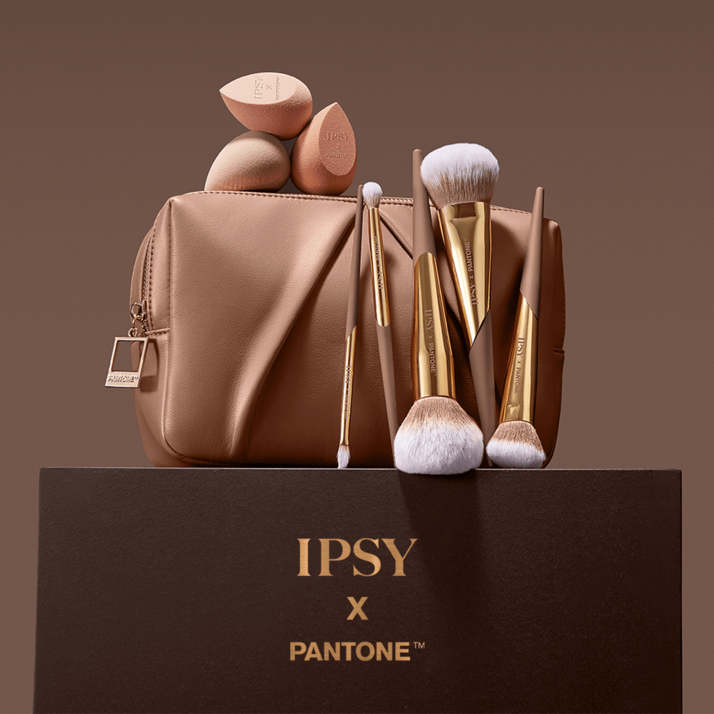
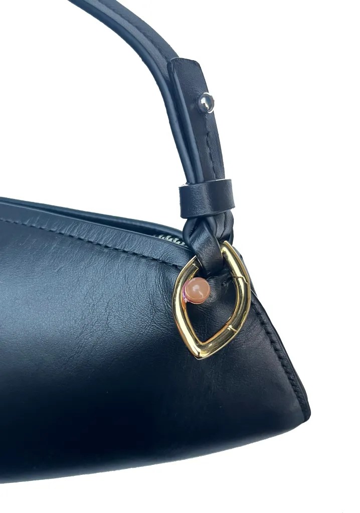
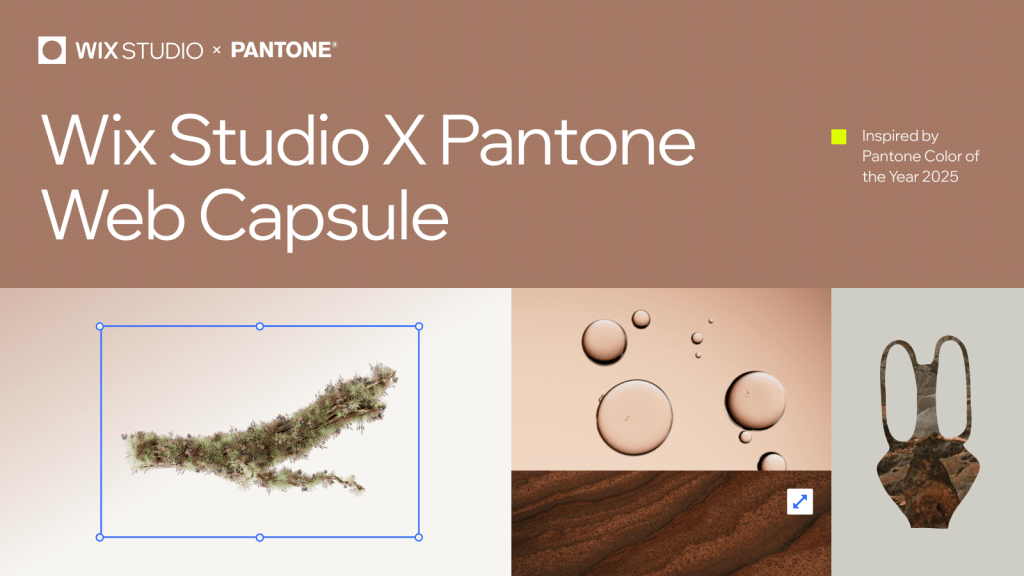
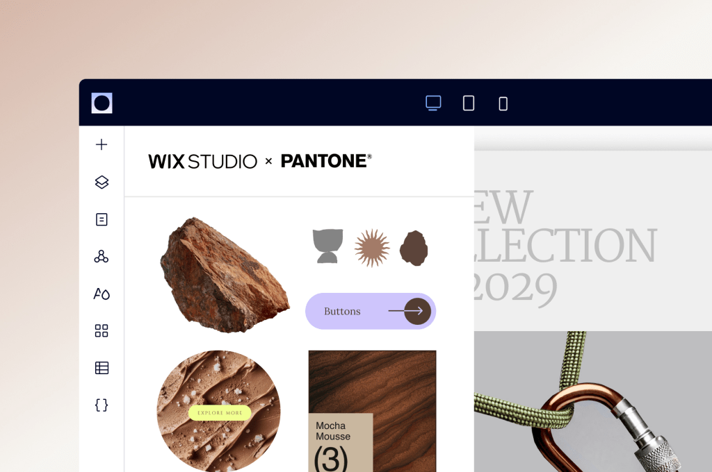
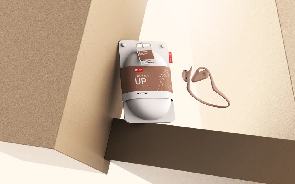
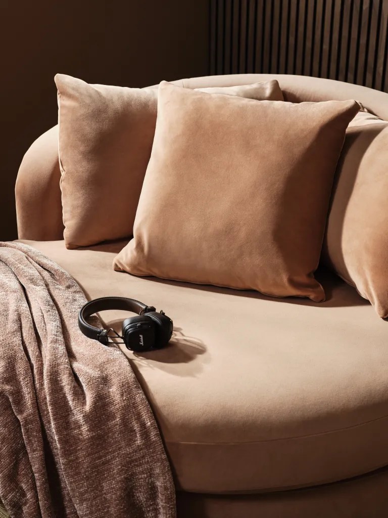
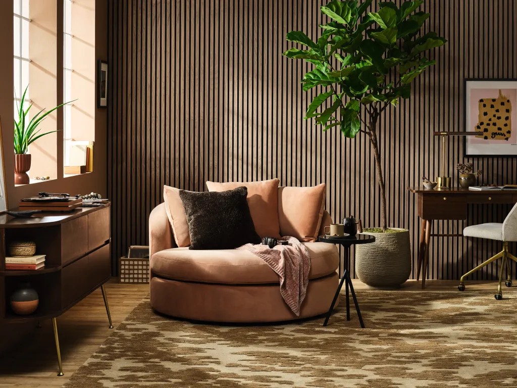
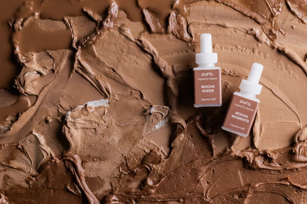
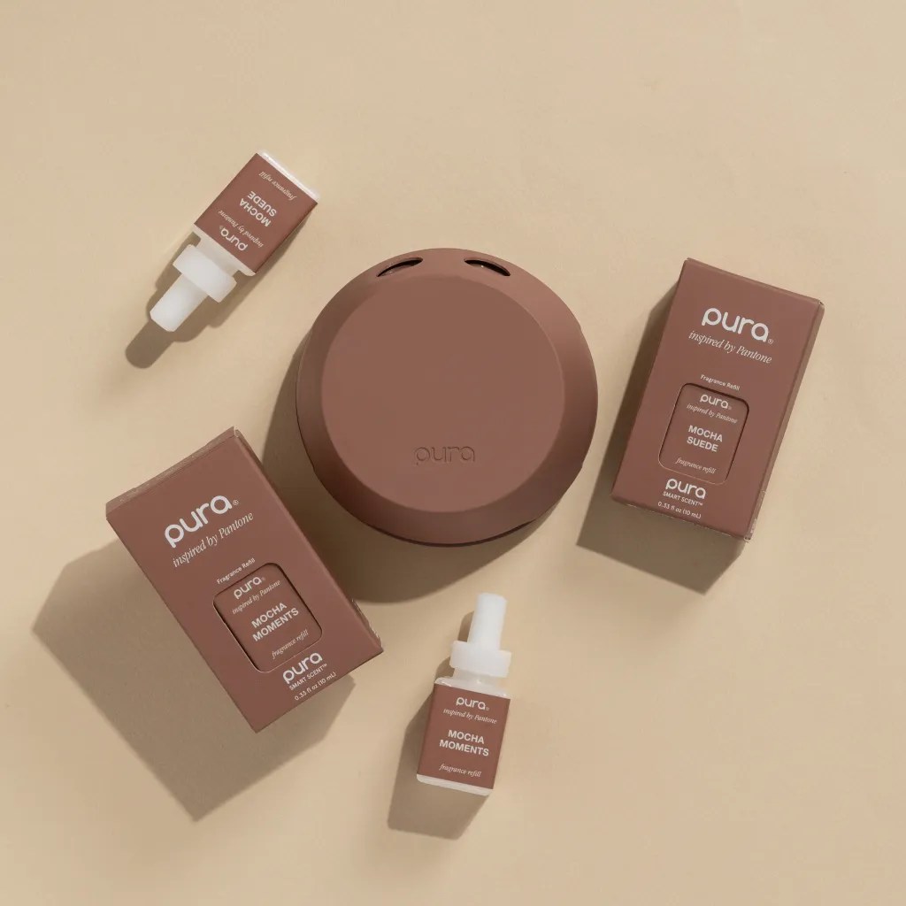
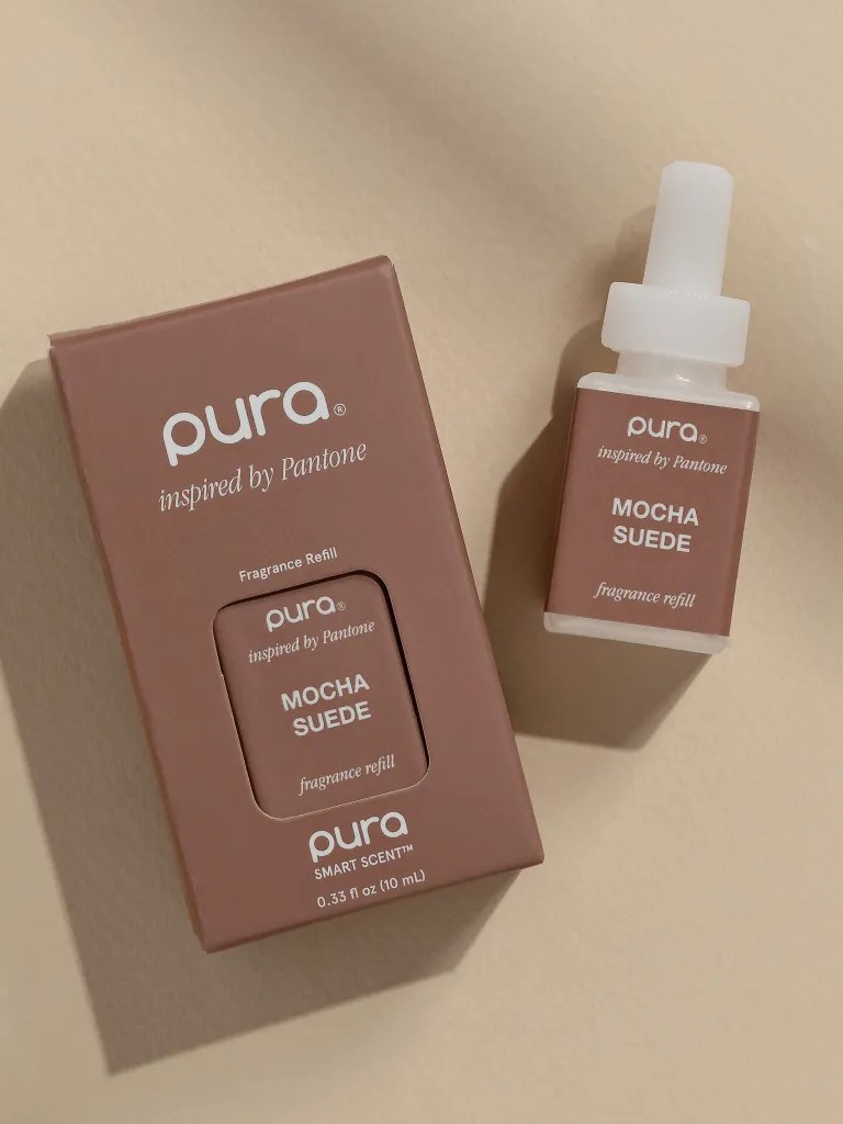
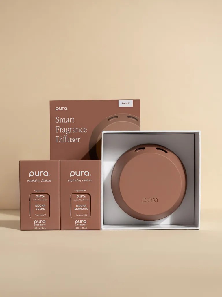
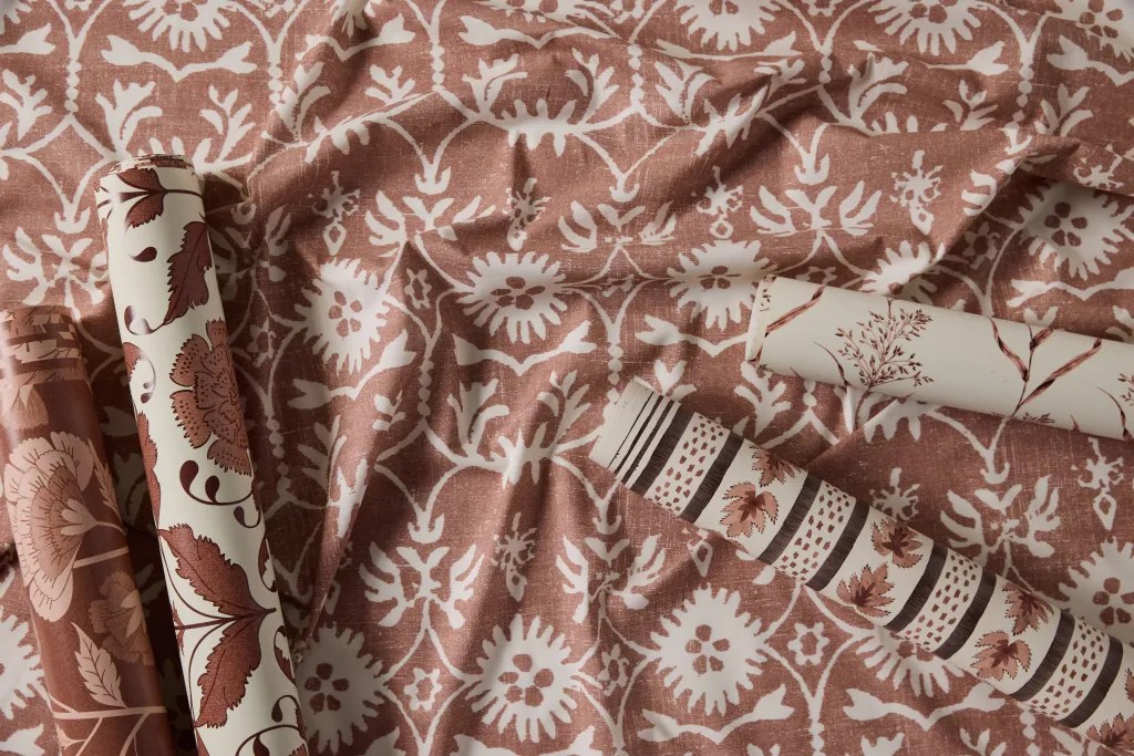
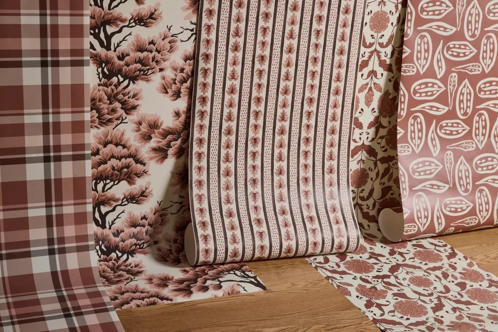
Pantone’s reveal, featuring a light show on the London Eye, certainly adds some drama to the announcement. The collaborations, too, are impressive: Motorola’s vegan leather phones and Joybird’s plush fabrics demonstrate how Mocha Mousse can be used across industries. Other product collaborations include Pura’s smart fragrance diffuser with custom scents, Wix Studio’s web design assets, Libratone’s UP headphones, Spoonflower’s print-on-demand home décor, IPSY’s limited-edition beauty products, Society6’s artist-driven designs, Ultrafabrics’ premium interior textiles, and Post-it® Brand’s special collection celebrating expressive color.





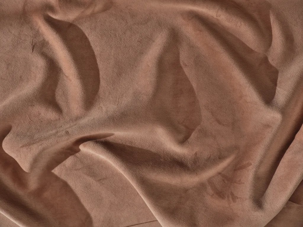
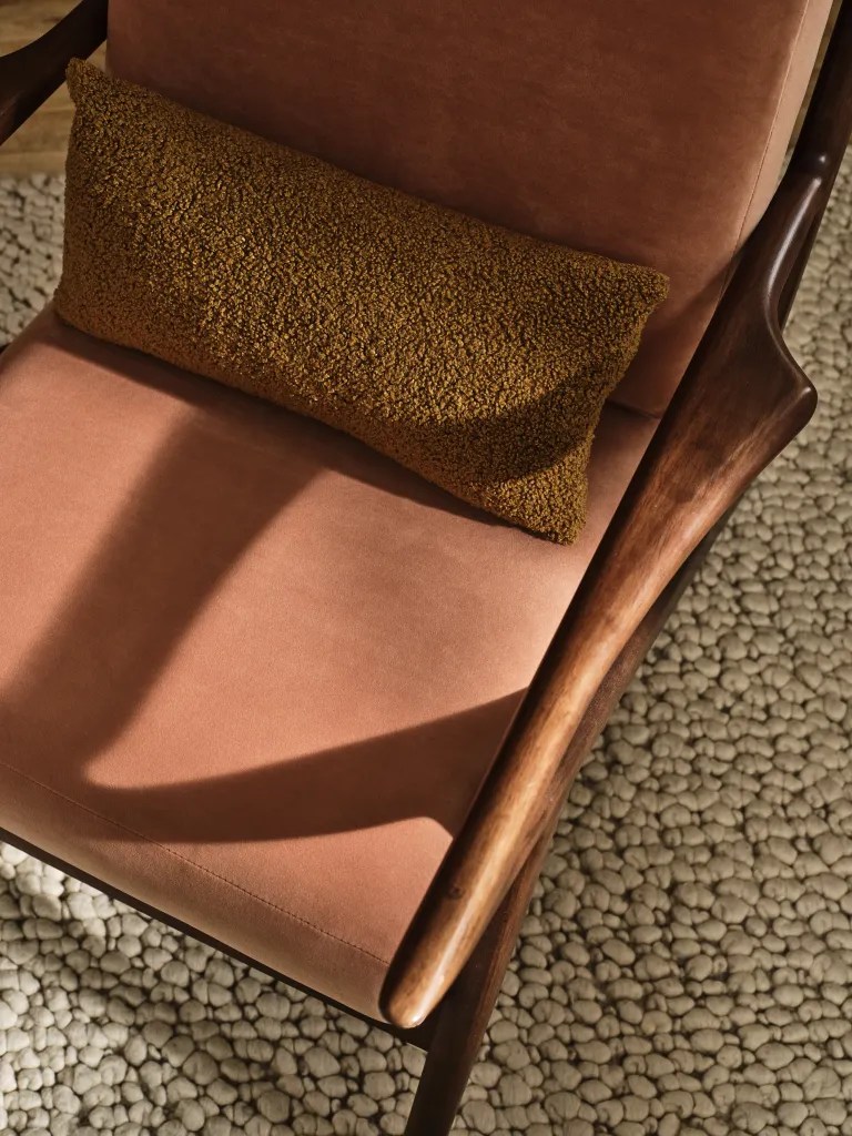

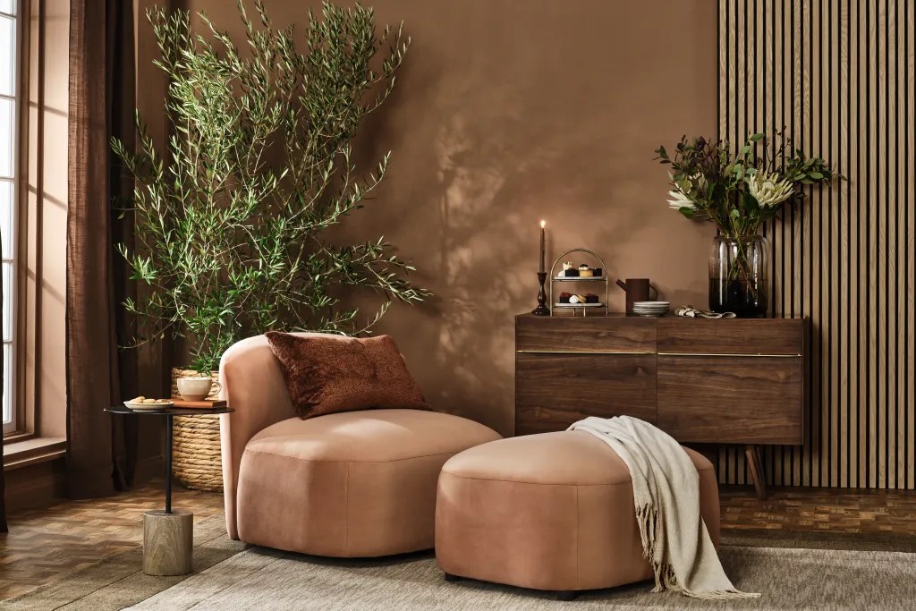
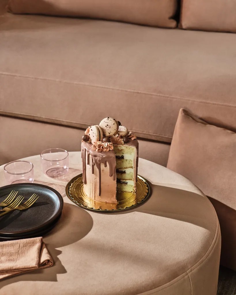
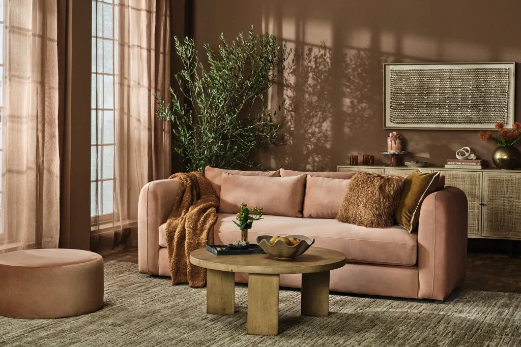
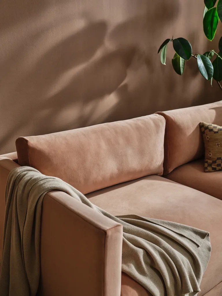
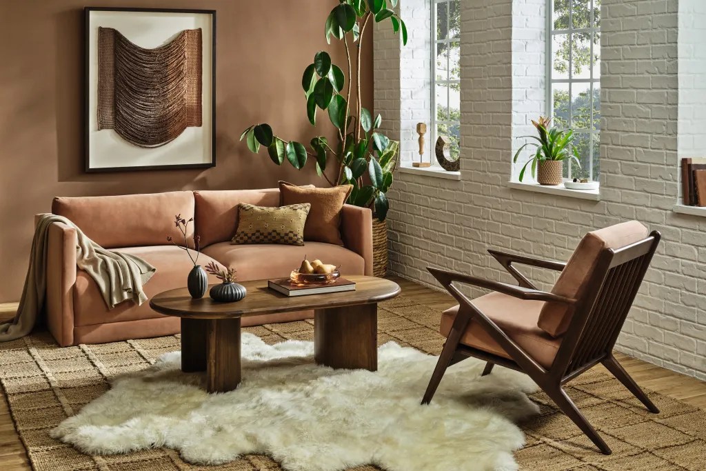
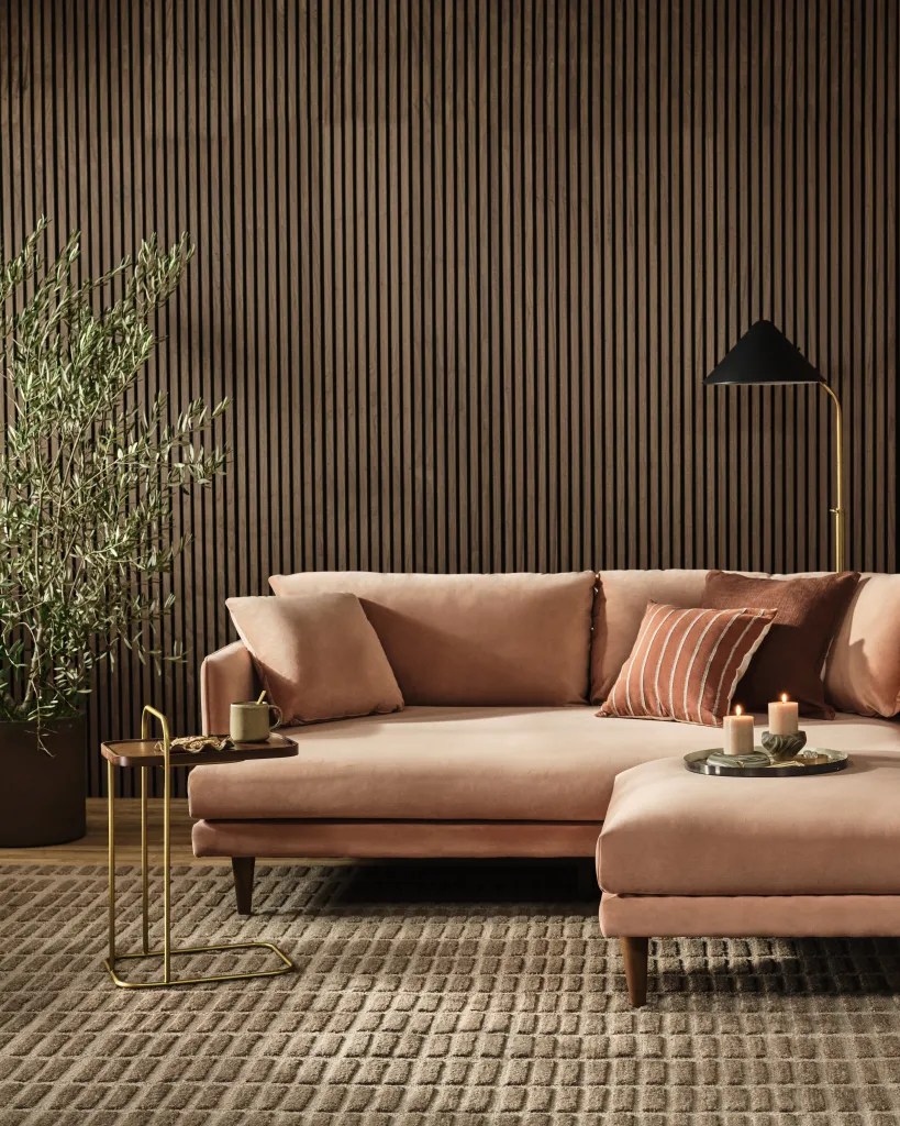

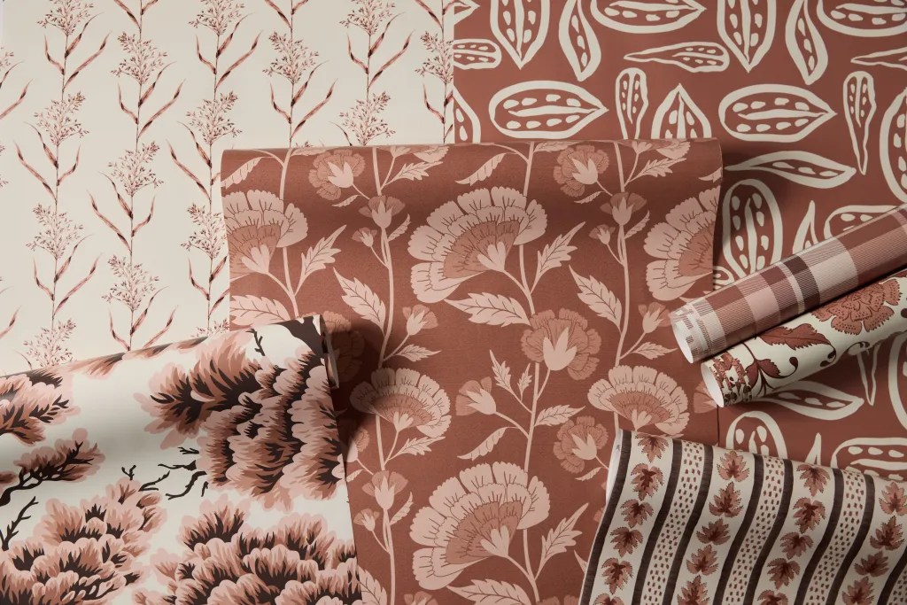
Still, the color feels understated, even subdued, compared to the bold selections of previous years. Perhaps this choice reflects a response to the chaotic and unpredictable events of 2024, offering a sense of calm and grounding in a time of upheaval. “The everlasting search for harmony filters through into every aspect of our lives, including our relationships, the work we do, our social connections, and the natural environment that surrounds us,” said Laurie Pressman, vice president of Pantone Color Institute. “Harmony brings feelings of contentment, inspiring a positive state of inner peace, calm, and balance as well as being tuned in with the world around us. Harmony embraces a culture of connection and unity as well as the synthesis of our mental, spiritual and physical well-being.”
…for Pantone Color of the Year 2025, we look to a color that reaches into our desire for comfort and wellness, and the indulgence of simple pleasures that we can gift and share with others.
Laurie Pressman, VP Pantone Color Institute
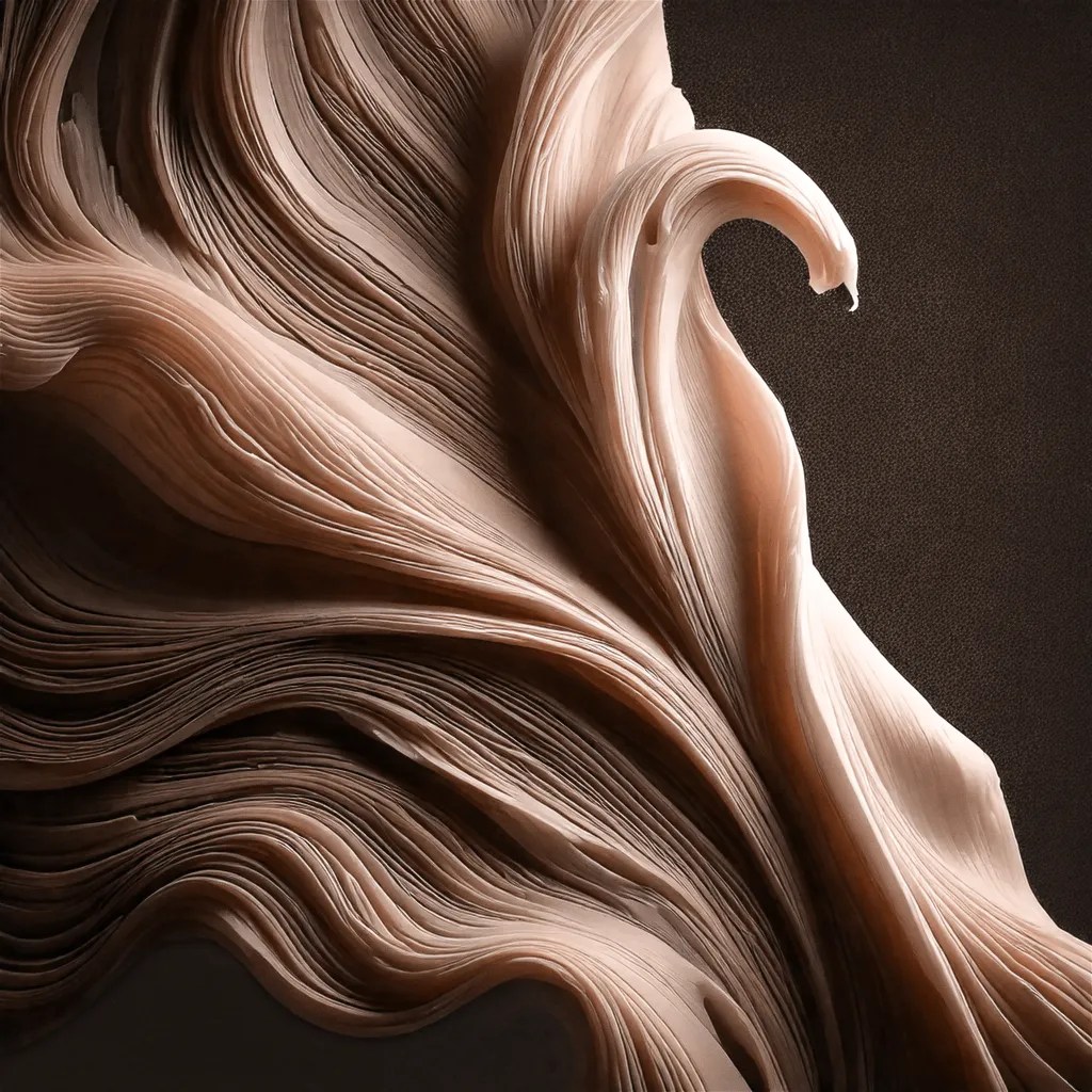
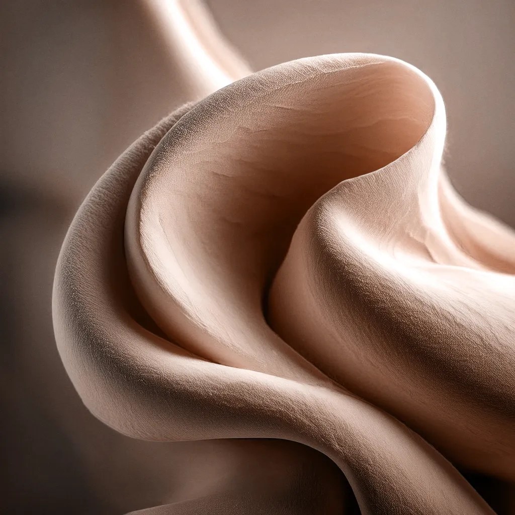
For designers, Mocha Mousse has potential. It’s a great neutral for grounding palettes, and its tactile qualities make it appealing in interior design and packaging. But it’s not the kind of shade that demands attention or inspires an immediate wow factor. Instead, it’s a quiet presence — more about being a harmonious complement than a leading show-stopper.
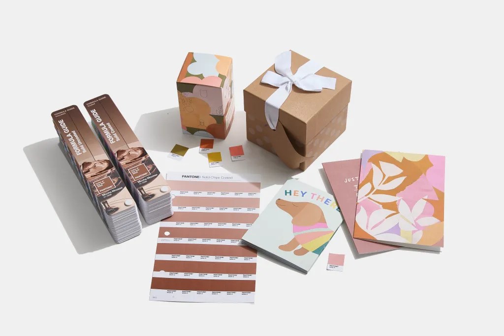
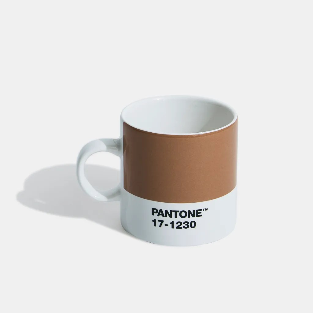
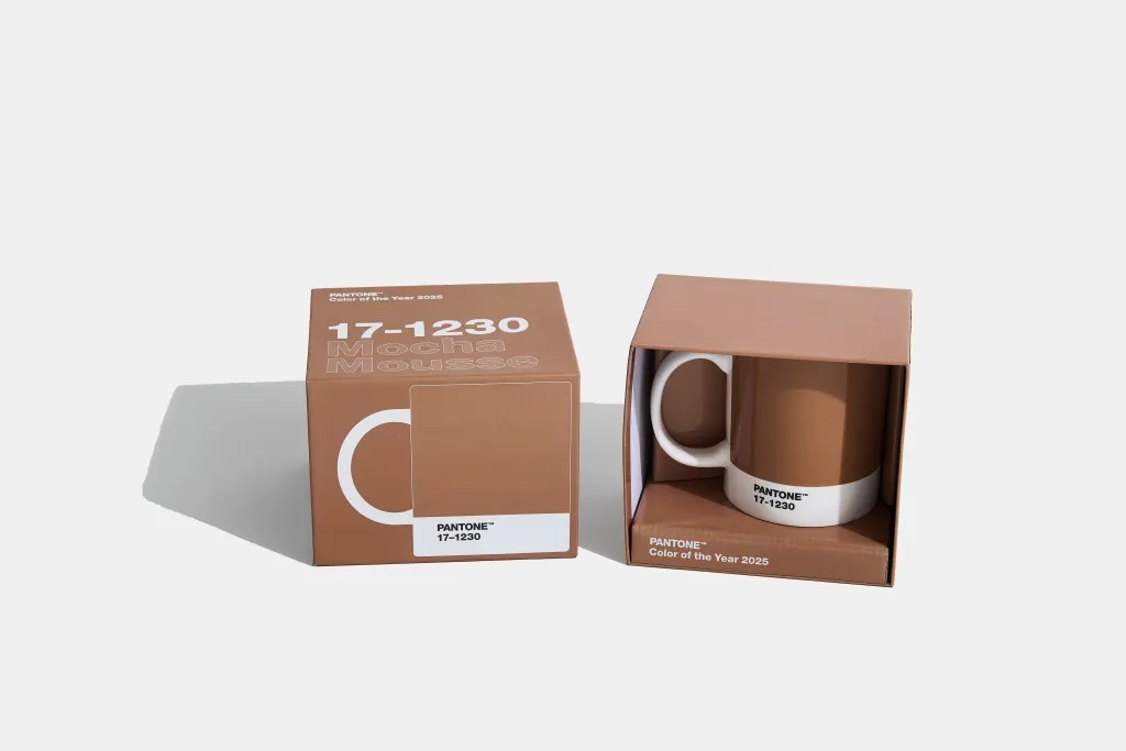

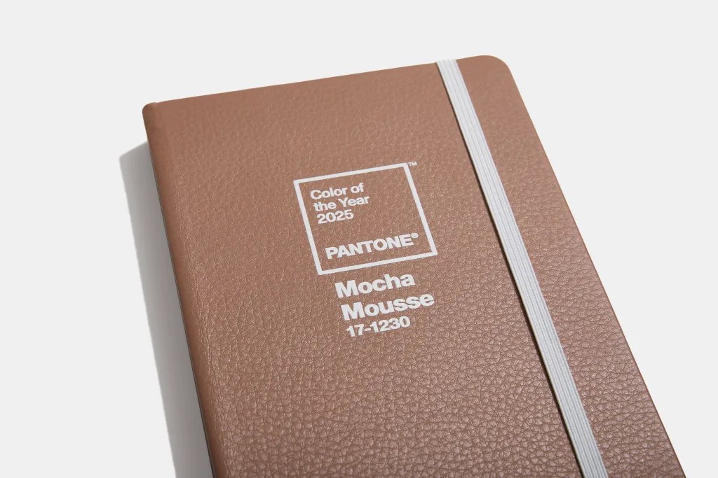
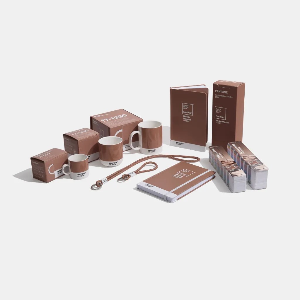

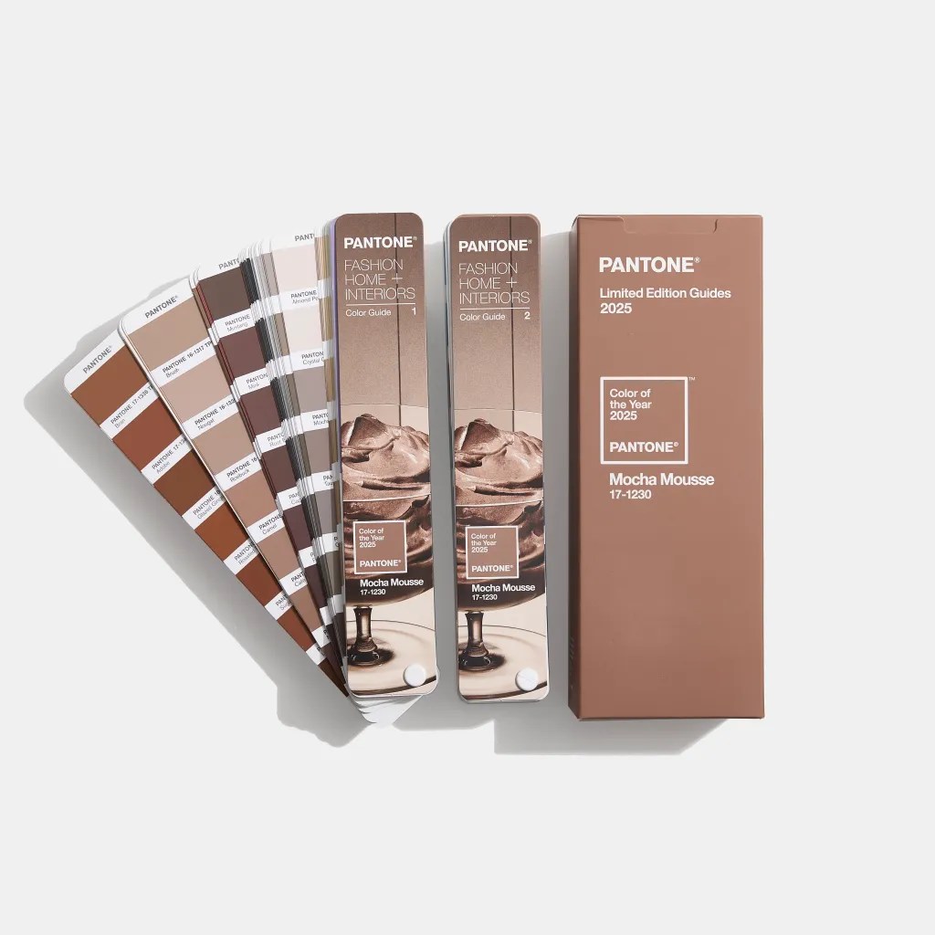

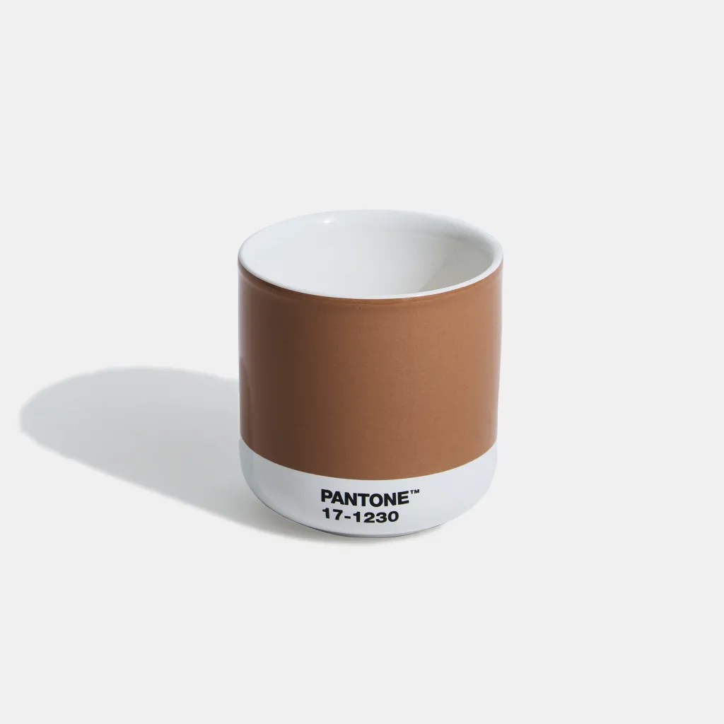
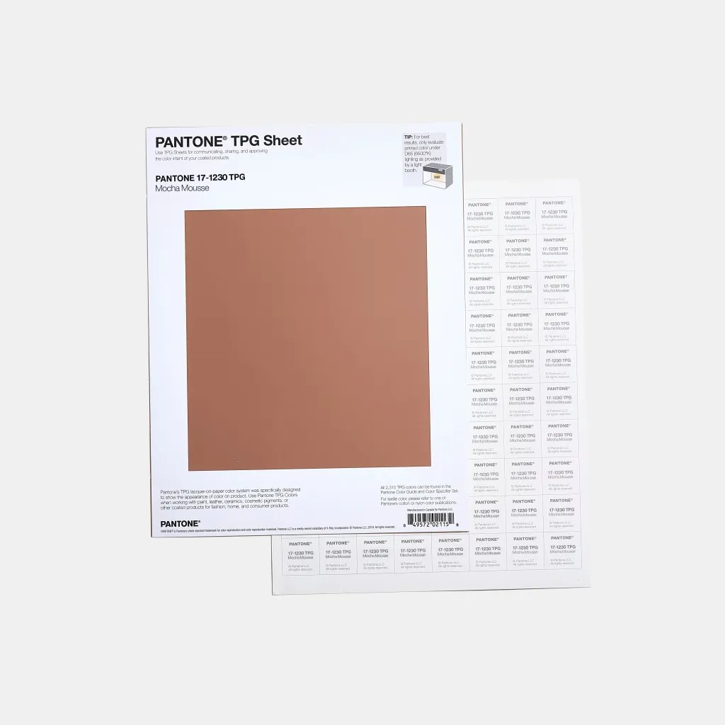
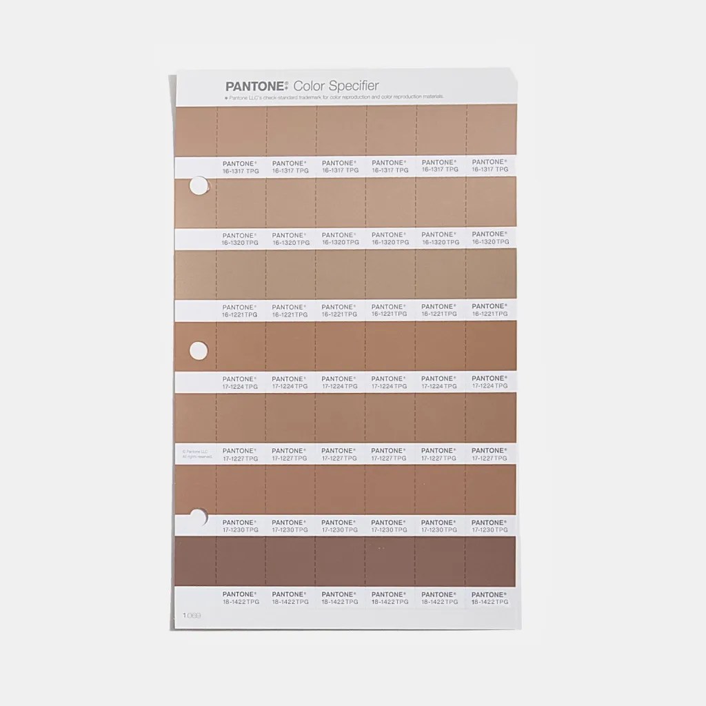
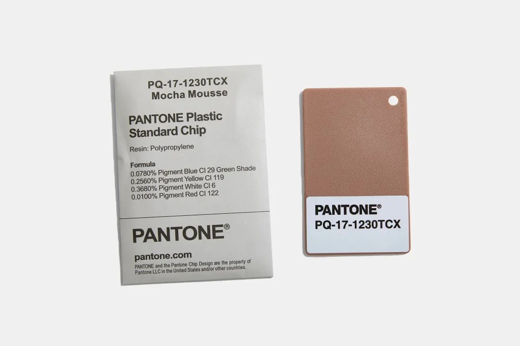
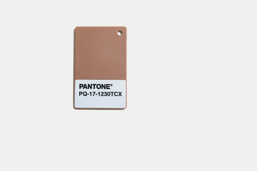
As we move into 2025, it will be interesting to see how this color plays out in real-world applications. Will it resonate with audiences craving simplicity and comfort, or will it fade into the background? Time will tell. For now, Mocha Mousse offers designers a tool for creating warmth and subtle elegance, even if it doesn’t quite steal the spotlight.
Imagery courtesy of The Pantone Color Institute.
