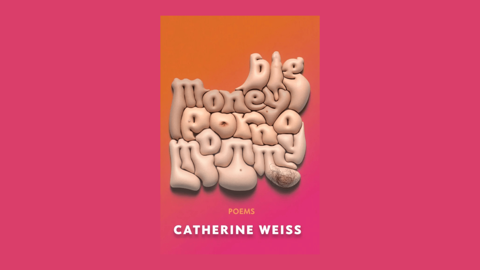
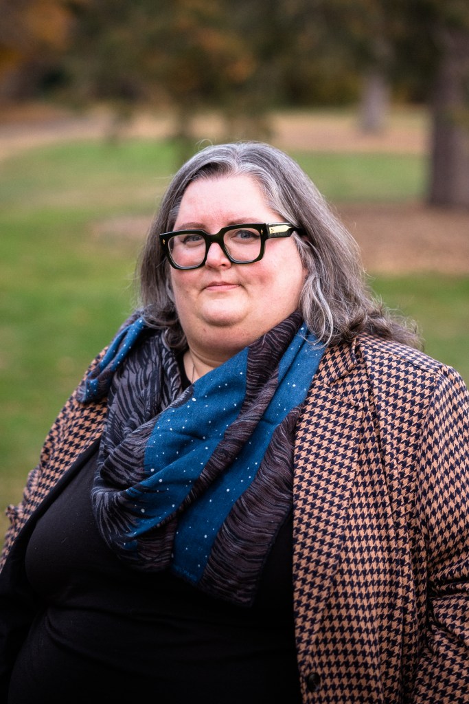
Rarely does a poet get to design the cover of their book of poems. And rarely does a book cover designer get to write the book for which they’ve created a cover. Having such holistic creative freedom, power, and control is many an artist’s pipe dream, yet it is one that recently came true for Catherine Weiss.
The Northhampton, MA-based artist is set to release their third collection of poems this coming March, provocatively entitled Big Money Porno Mommy. With a title like that, one needs an equally compelling cover, which Weiss was able to not only envision but also bring to life.
“Big Money Porno Mommy is about power and desire. It’s about pornography and my choice to not become a mother. It’s about the male gaze and how it’s wielded. It’s about all of these things in the context of my body, which happens to be a fat body,” Weiss penned in a piece they wrote reflecting on the book and its cover. “The physical forms of those we love and lust after—even the bodies we idealize—they’re all kind of ridiculous when you get close enough.”
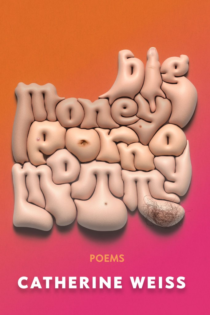
The cover of Big Money Porno Mommy encapsulates this playfulness, capturing both the grotesque and the organic beauty inherent to the human body. The ability to harmonize two ideas that might initially seem at odds with one another is central to Weiss’ practice as a poet and something they were keen on evoking in their book’s cover.
“I needed the flesh to be forefront. I wanted to evoke fatness and nudeness but without a silhouette—fatness as the text itself. Many people have instinctive reactions to the form of a fat body. I wanted this cover to elicit a reaction, but rather than othering the form, and projecting whatever preconceived notions about fatness they may have onto my book, I wanted to bring the audience in.”
After seeing the cover of Big Money Porno Mommy and reading Weiss’s initial thoughts on their process, I was eager to talk to the artist. My Q&A with Weiss, in which I dig even deeper into their process and their reconciliation of clashing concepts, is transcribed below.
(Edited lightly for clarity and length.)
The physical forms of those we love and lust after—even the bodies we idealize—they’re all kind of ridiculous when you get close enough.
Catherine Weiss
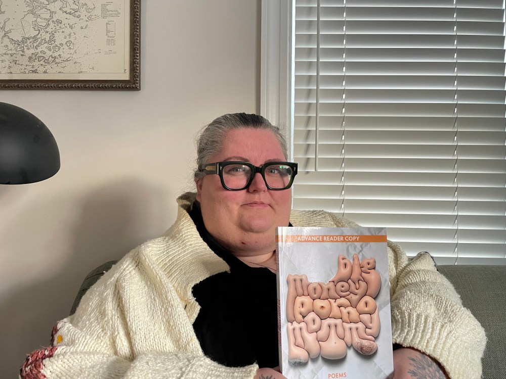
What’s your process typically like for writing your poems?
When I think about writing poems, I try to see if a poem can do more than one thing at a time. It’s hard to write a poem that’s just about one thing, I have found. When I sit down to write a poem, I have two ideas, and then maybe the third thing that comes out of it is the poem. So when I was thinking about designing this cover, I was similarly interested in having more than one idea.
The cover is so striking. What was your thought process behind that design?
I was also interested in having the typography contain this fleshiness, so you get the information from what the words literally say, but I also wanted the typography to give information as well. Having the title literally embodied in flesh was one way to do that. Then layering the little details of specificity onto the letters, like, Is there a belly button? Is that a tuft of hair? Things that would both hopefully draw someone in to look, and also be a little bit like, Ooh, do I want to look at this? To have that push and pull.
The typography definitely captures that two-things-at-once idea you’re going for. It’s pretty grotesque, but simultaneously warm and pillowy and even comforting which complicates that initial disgust. At what point in the writing process did you design the cover?
Once I had about half of the poems, I said, Okay, well, this is a collection. This is going to be something. And I had the title, and I kept writing poems to keep adding, so that’s when I started brainstorming what the cover would possibly look like. I kept coming back to this idea of flesh letters and fat rolls. An early iteration looked more like Sharpie on my stomach, and I thought about having a photograph instead of doing it digitally. But at a certain point I realized I needed to learn the software to make my vision happen.
One of the things about writing the poems and designing the cover is that I got to spend a lot of time with both of them. I got to spend a ton of time with this cover. I kept iterating and putting it in a drawer and then coming back to it as more poems got written.
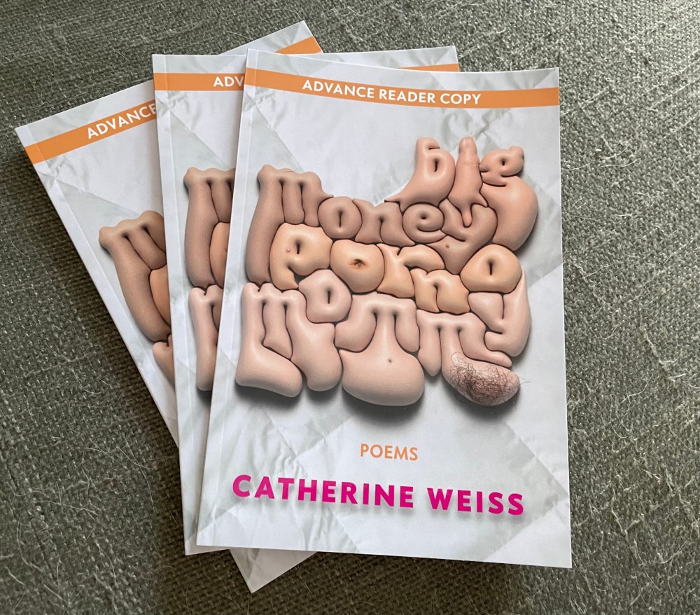
Can you speak about that technical side of things in terms of the cover? What software did you use? What was your design process like?
This is created in Adobe Illustrator and Photoshop. Illustrator has a very simple tool that allows you to blow up text or other shapes to inflate them in this faux 3D space. Once I realized that tool was pretty simple and I could play with it by adding skin texture, I spent a lot of time finding the right skin texture to make it look as gross as possible.
I also spent a lot of time trying to figure out what the shape of the letters was going to be, because I wanted it to be legible. The first iteration was much more blocky and the letters were separated from each other, so it looked a little bit more like someone had been chopped up. That wasn’t quite right and that was also much harder to read.
I didn’t really spend much time sketching but iterating in the software. How far can I distort this letter pattern to make it legible and also to get the effect that I’m looking for?
What was your thought process behind the colors of the cover, particularly the magenta-to-orange gradient background behind the flesh-toned lettering?
Until quite late in the process, I had a different background entirely. For a long time, it was a comforter, pillowcase sort of texture. Ultimately I didn’t stick with that because it was just a stock photo that didn’t really interact with the weight of the letters, and it was taking attention away from the letters themselves.
I wanted the cover as a whole to pop, so I knew I wanted something bright and cheerful, and I just love pink and orange. It’s been a color combination that I’ve been drawn to. Also, this is my third full-length collection, so I kept in mind my previous collection which was sort of a green. So, I thought, What do I want these books lined up on a shelf to look like?
Now that the poems and cover are all done and dusted, what would you say you’re proudest of with what you’ve created?
I think letting myself sit with the uncomfortable. Even with the cover, being able to forefront the discomfort while not giving up the joy that is found in this collection.
This collection has a series of poems called “The Phone Sex Poem,” and they tell a story about a bad relationship and a boyfriend who was addicted to phone sex. They’re about the ramifications that it had on my life, and the reverberations going forward in terms of my relationship to sex and desire.
On the face of it, that was a really hard thing to write about. I’d been aware that I’d been choosing not to write about it for several books, and I think it was really important for me to find an entry point that was playful in order to talk about a difficult subject. I think I found a balance that not only isn’t a bummer to read, but I also feel comfortable putting out into the world and telling my story in a way that feels holistic and worthwhile.
Look for Big Money Porno Mommy by Catherine Weiss on shelves in March 2025.
