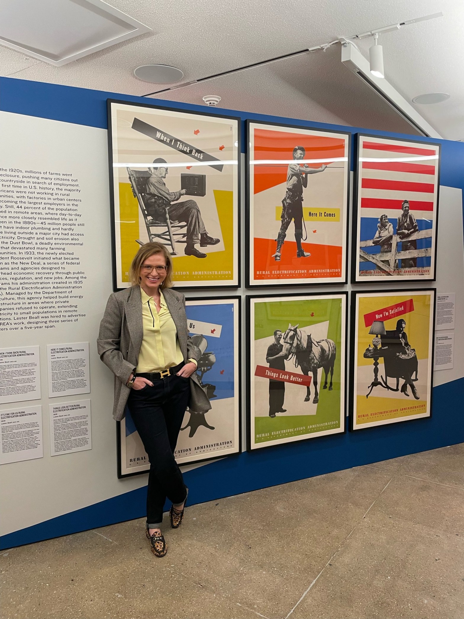
And we’ve asked her to sit down for an interview about her new role and curatorial future . This is quite a month for you. You curated two of the three exhibitions that just opened and you have been named as director of Poster House. Congratulations! How will you juggle your curatorial and directorial duties?
Carefully! We actually plan our exhibitions five to seven years in advance, and I’d been pacing the calendar so that I was offering our new Assistant Curator of Collections, Es-pranza Humphrey, more curatorial opportunities. As such, I was already weaning myself off of doing as many exhibitions per year and focusing more on traveling shows, poster education, and proselytizing the wonders of Poster House. In the short term, I recently handed in the first draft of the main spring show that I’m co-curating with Tim Medland, and I was able to hand off curation of an Italian fascism show I really wanted to do myself to the fantastic B.A. Van Sise. This doesn’t mean I won’t be curating again, but rather that I want to get my directorial sea legs before I attempt to do both jobs at once. In the meantime, my capacity as Curator at Poster House will remain as the person who sources exhibitions, reviews shows, chooses guest curators, and orchestrates a curatorial rhythm within our exhibition calendar.
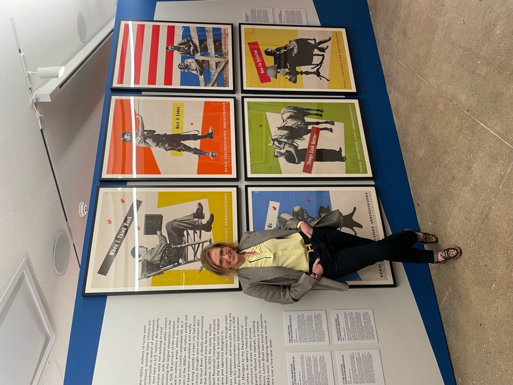
Let’s talk about the exhibitions. I’m excited about both, “Lester Beall & A New American Identity” and “Fantastical Streets: The Theatrical Posters of Boris Bucan.” These, along with “Just Frame It: How Nike Turned Sports Stars into Heroes,” constitute your fall schedule. How do you decide what shows to feature and which ones you will curate?
The Nike exhibition was actually a long-term desire of our outgoing director, Julia Knight. She’d wanted us to do a show on Nike’s posters since before we opened, so I’m thrilled that we got to mount it with Adam Howard while she was still here. The Beall and Bucan shows were both exhibitions I’d been interested in for quite a while, but needed to find proper places on the calendar to slot in, especially as Bucan is featured in our Jewel Box space that hasn’t been utilized in this capacity since our very first exhibitions on Alphonse Mucha and Cyan. Once I understood the layout of Nike, I knew I could bring back the Jewel Box gallery, and that is a perfect space for Boris Bucan. As for which ones I have previously decided to curate, my specialty is pre-1960s European, American, and Latin American poster design, so whenever we have the opportunity to borrow pieces that are part of the classic canon, that’s my natural bread-and-butter — and who would give up the opportunity to curate a show featuring the only time in history that every poster Beall created for the REA is in one room?
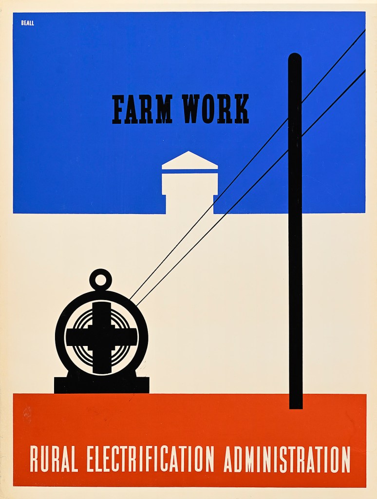
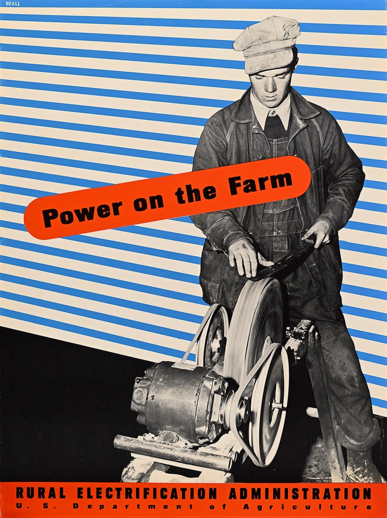
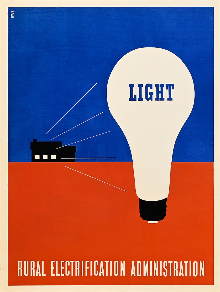
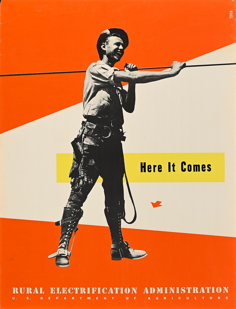
Lester Beall’s poster series for the Rural Electrification Administration, the government agency responsible for bringing power to the rural south, are masterpieces of American Modern design. They’ve become iconic. What is the story behind Beall, a designer from CT, getting and executing the posters the way he did? So, they weren’t just used in the rural south – they were a national campaign, with evidence of them traveling to Appalachia, the South-Eastern United States, the Midwest—really, all over. But they weren’t just used in rural areas to convince people to buy into electrical co-ops. They were also used in major cities, mostly Washington, D.C., to convince people (read: wealthy white men) to support FDR’s policies around electrification. They were just as much urban propaganda for a liberal policy as they were advertisements for a domestic amenity. Today, they stand as what I believe are the best examples of American Modernism before the war. As for how Beall got the commission and executed the brief, very little is known regarding specifics. I spent a week up at RIT where Beall’s archive is held, and while there are invoices and a few letters around this series, there is no document I can point to that tells us why he was chosen. My best guess, which I state in the wall text, is that he was always an independent agent, and not being tied to a larger advertising agency made him a lot easier to deal with than a more corporate entity. He also was highly adept at taking European Modernist concepts and filtering them through a much more literal American lens. We’re the land of Norman Rockwell and James Montgomery Flagg, not the Bauhaus — finding a way to be direct and to sell something through a streamlined version of modernism was something Beall mastered at that time, and which made the posters stand out among their peers.

What did you discover about Beall’s work that made you focus on “A New American Identity”?
That part of the title is less about Beall’s work specifically (although it does apply), and more about how the work Beall produced was promoting a cultural shift in America. When Beall was hired to create the posters for the REA, only 10% of the United States had access to electricity. By the time the third series was printed, that number was up to 50% (and would be 90% by the end of the decade). That’s a staggering amount of progress that happened in a relatively short period of time — and I can’t overstate how life-changing electricity is. The wall labels I’ve written actually go into pretty deep detail on what any task depicted in a poster would have involved pre-electricity. For example, laundry without electricity is a three-day task, starting with killing a pig to make lye soap. You then have to pump water, physically, usually outside; boil that water; agitate the clothes with the soap; get more water to rinse them; and then hang them outside to dry, which, in the colder months, meant they froze. Once you have electricity, that’s the work of an afternoon. Beall is advertising a service that changed the way Americans lived.
Do you believe he was the wellspring of collage as a Modernist tool in the U.S.?
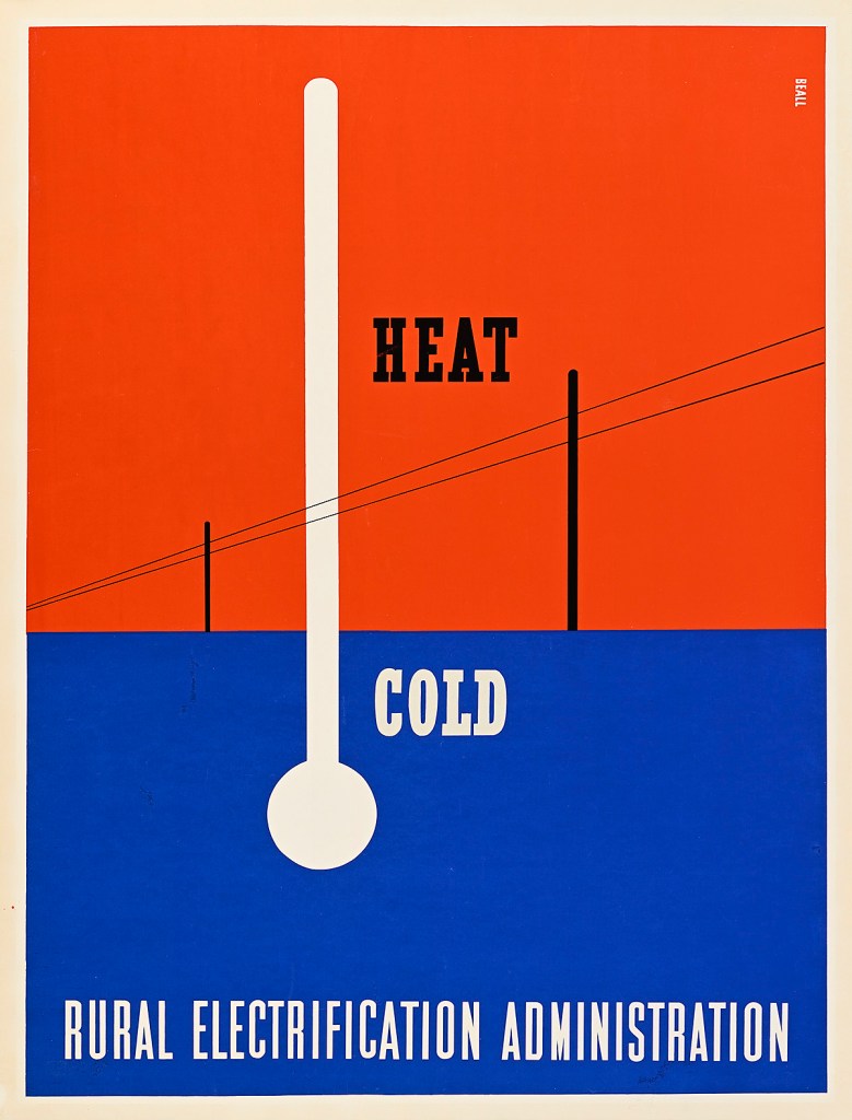
It’s interesting that you think of his work as collage, though that’s obviously not wrong. I think his version of photomontage/collage/photogram is different from a lot of what inspired other designers working in the United States, be they local or of foreign extraction. It lacks the chaos and cheeky humor of a lot of Dada collages that would have been known at the time, and it isn’t as slick or soulless as a lot of the more corporate-style photomontage designs that were being made simultaneously. For example, I love Erik Nitsche (and am doing a show on him in the spring), but Beall’s use of photography is much less clinical than Nitsche’s, while also managing to be less abstract. He’s using photographic elements to play with scale and space and to draw one’s eye around the composition. It’s much more dynamic and inventive than a lot of what else was being produced—and, as such, I absolutely think that he added to the interest in collage as a Modernist tool in early 20th-century American design.
Why does his work look so fresh today?
As with a lot of modern design that manages to retain its power over the decades, I believe Beall’s work remains exciting and impactful because it didn’t rely on trends, so it avoids looking dated. His concept of “thrusts and counterthrusts” is just a means by which a designer keeps the viewer’s eye moving fluidly around a page, and that’s something all designers still want people to do when viewing their work. His approach is timeless.
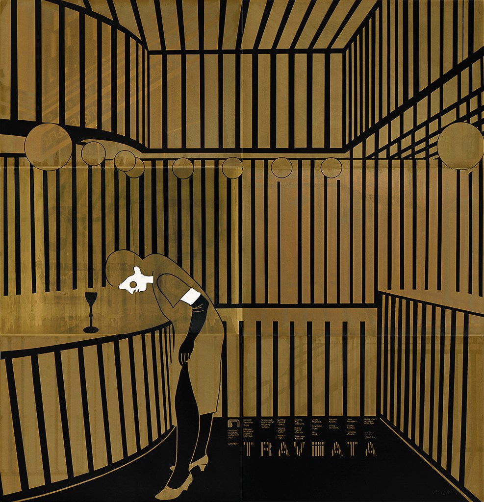
You also show a group of striking posters by the late Croatian designer/painter Boris Bucan. What particularly attracted you to this well-known in Europe but virtually unknown in the US design work?
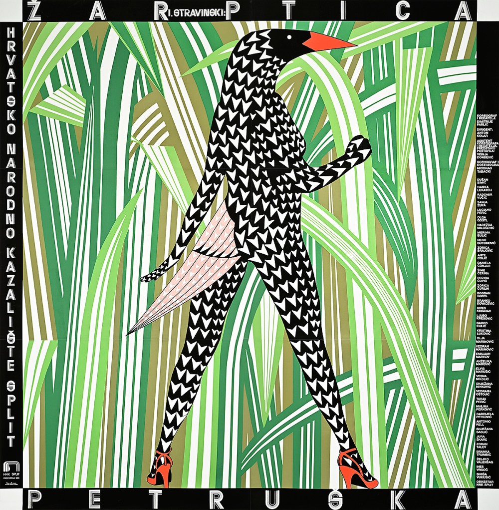
Oh, I’ve been a fan of Bucan forever! His Firebird, which is featured in the show, was the cover of The Power of the Poster, a text any poster historian knows well, and he is, I believe, the ONLY designer to represent his country at the Venice Biennial with posters (some of which are also in the show). I only wish I had more access to more of his work that I could have made a larger exhibition to celebrate him.

Are his posters in your growing Poster House collection?
Yes! All but two of the pieces in the show belong to us, and we have a variety of other posters by Bucan in our archives. They were actually some of the first posters the museum purchased when we were founded.
Do you try to find some link between shows? If so, I don’t see the two above as related to each other or the Nike show. What is your curatorial logic?
In general, I craft the curatorial calendar to make sure there’s as much diversity of expression as possible on at any given time. With these shows, we’ve got classic American modernism, pop culture sports stars, and a lesser-known but incredibly important Eastern European designer. We’ve also got a London Underground and Munich Olympic show opening in November–so there’s something for everyone. That said, there’s always some dialogue between the shows. In this case, the Nike posters are created at the same time as the posters by Bucan—demonstrating how vast the design world is at any moment in time. Meanwhile, Bucan’s posters are made through silkscreen, as are Beall’s, demonstrating how one production method can result in striking different outcomes.
As director will you be doing less curatorial work, or just loading everything on?
While I just handed in my last big show for the next few years that will be opening this spring, I will continue to construct the curatorial calendar and work on building exhibitions—just less in a writing and research capacity. That said, I’ve already found that the director role is just as intense as my former chief curator one, so I’ll be keeping just as busy, I promise.
What is your personal vision for this unique museum that is now under your wing?
I’ve been a poster historian all my adult life, and being able to shape the trajectory of poster scholarship and appreciation through an institution as specialized and unique as Poster House is both humbling and exhilarating. The previous director, Julia, was tasked with building a reputable museum from scratch—and she did that exceptionally well. Now that we’re more established, I want to push the museum to be the go-to authority on poster history by delivering incisive and entertaining exhibitions that you can’t see anywhere else. I want Poster House to make people fall more in love with this medium and see it as just as legitimate, if not more important, than fine art as a means through which we can understand the history of visual communication.
