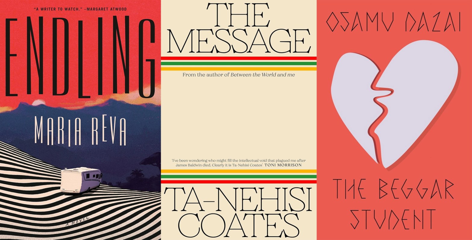
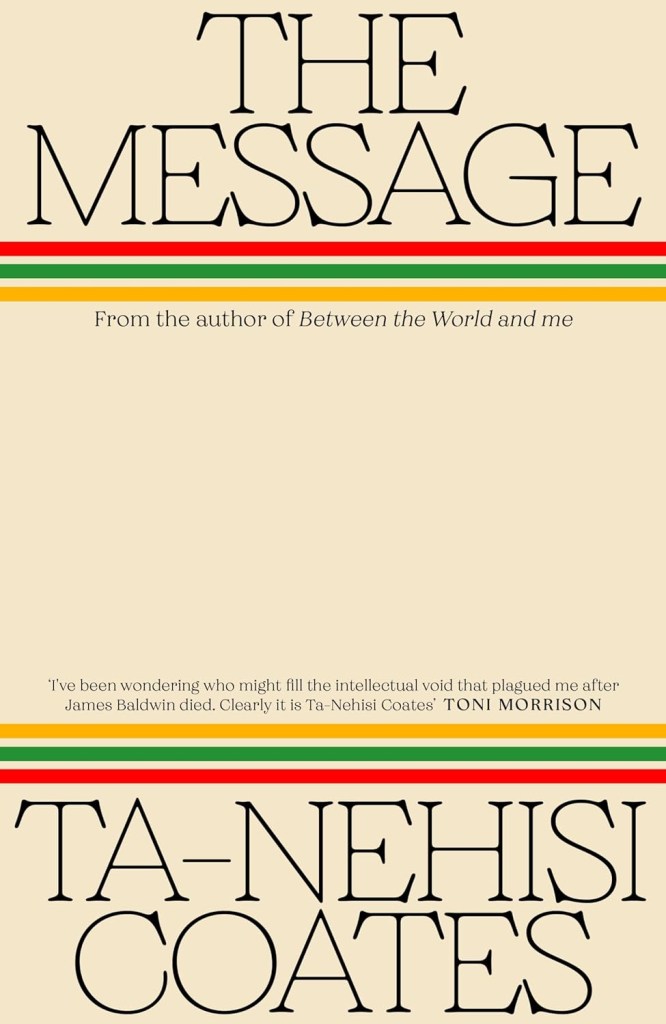
We took a pause from our regular book cover coverage in October—which, apparently, was a mistake, as a slew of brilliant jackets sprung forth from the digital ether while we were following other editorial rabbits down holes. So this month we’re playing catchup and spotlighting a medley of great covers unveiled in October and November, beginning with Chris Bentham’s jacket for Ta-Nehisi Coates’ The Message, which he discusses below.
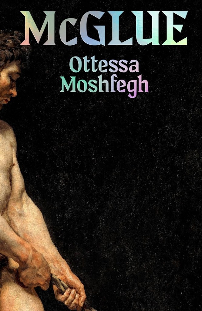
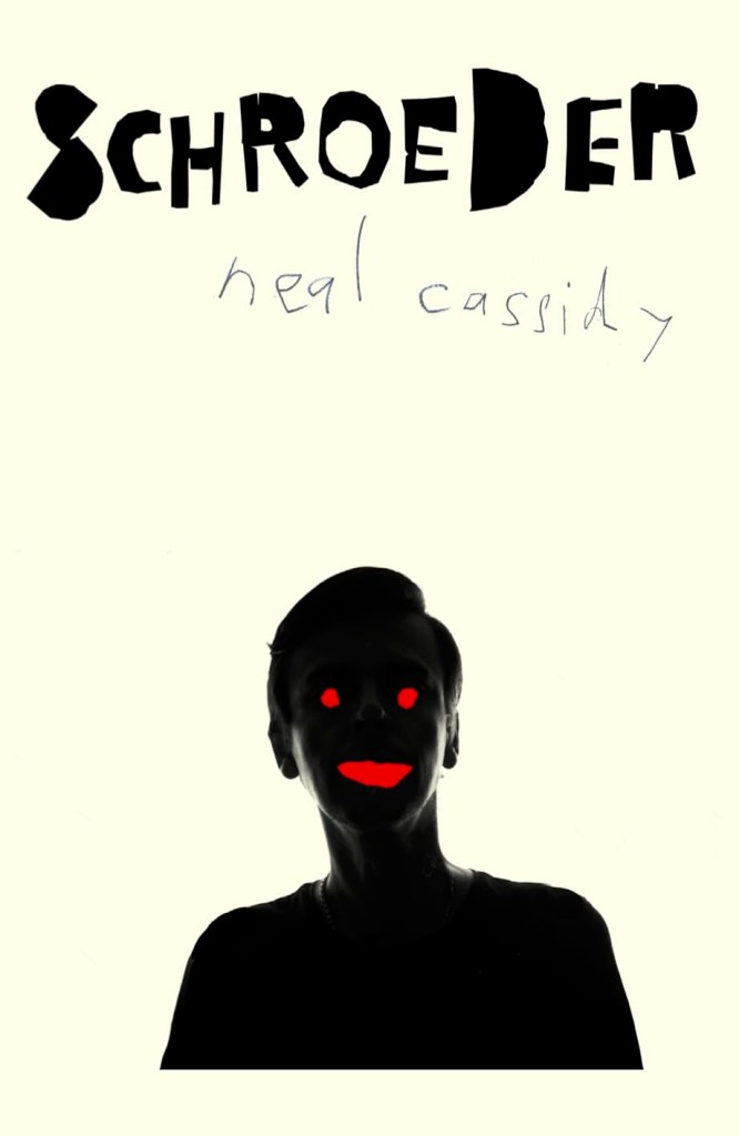
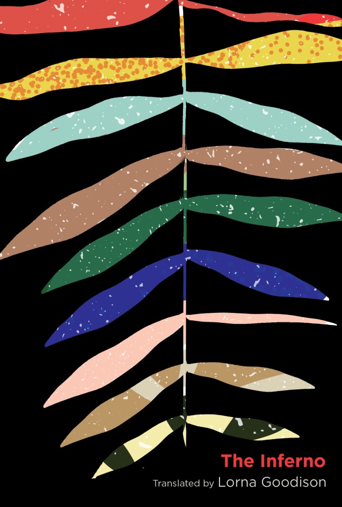
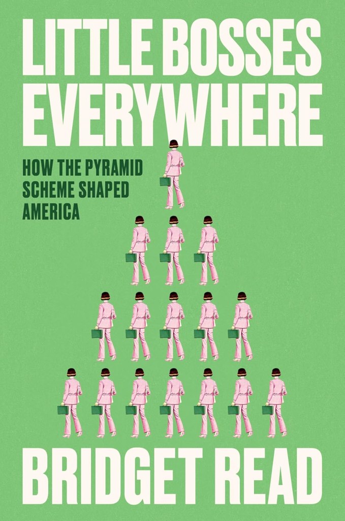
From a fresh face (or lack thereof) on some Murakami, to Dante’s Inferno as you’ve never seen it, to a psychedelic Clockwork Orange experiment, the rest of our favorite finds from the month(s) follow!
Publisher’s description:
With his bestseller Between the World and Me, Ta-Nehisi Coates established himself as a unique voice in his generation of American authors, a brilliant writer and thinker in the tradition of James Baldwin.
In his keenly anticipated new book, The Message, he explores the urgent question of how our stories—our reporting, imaginative narratives and mythmaking—both expose and distort our realities. Traveling to three resonant sites of conflict, he illuminates how the stories we tell—as well as the ones we don’t—work to shape us.
The first of the book’s three main parts finds Coates on his inaugural trip to Africa—a journey to Dakar, where he finds himself in two places at once: a modern city in Senegal and the ghost-haunted country of his imagination. He then takes readers along with him to Columbia, SC, where he reports on the banning of his own work and the deep roots of a false and fiercely protected American mythology—visibly on display in this capital of the confederacy, with statues of segregationists still looming over its public squares. Finally, in Palestine, Coates sees with devastating clarity the tragedy that grows in the clash between the stories we tell and reality on the ground.
Written at a dramatic moment in American and global life, this work from one of the country’s most important writers is about the urgent need to untangle ourselves from the destructive myths that shape our world—and our own souls—and embrace the liberating power of even the most difficult truths.
What was the brief for this book?
The brief was a very simple one: simplicity, strength, and a three-strand story. Then, a lot of discussion with the editor around really capturing the essence of the book. In terms of visuals, it was completely open.
Tell us about the blank space in the middle—how you arrived at it, and what it represents.
The blank space in the middle was almost not an intentional solution. I felt the overall package needed a timelessness to feel intriguing, and powerful but also elegant. The temptation with a book like this is to make a bold countercultural statement, to rely on protest graphics, etc., to give it an outsider attitude, which would be a completely valid approach and is certainly something I explored early on. But I also felt strongly that I wanted to play up to the alignment [of] Ta-Nehisi Coates in the lineage of socio-political [authors] such as Toni Morrison, Noam Chomsky, and James Baldwin. With that in mind, I wanted to convey clarity and authority. I felt the title and author name in themselves did a lot of that work for me.
How did you choose the type treatment?
The typeface I used was Grobek; this arose partly [because] it’s not a type aesthetic I have used previously (sometimes, there’s no better reason than that) but also this goes back to my decision to shy away from protest graphics in this design route. I decided to do the opposite, something elegant and light with a slightly unconventional serif. Somehow I found that through not being shouty, this stood out more, possibly due the sheer mass of negative space on the cover, which is echoed with a lighter typeface with huge counters.
How about the color bands?
The color bands frame the type elements, anchoring them to the top and bottom of the jacket. They are simply a reference to the three strands of the journey undertaken by the author, referencing Senegal, Palestine, and the U.S. But they also serve a purpose in harking back to Midcentury book cover design, further signaling the literary lineage I wanted to emphasize for Ta-Nehisi.
Is it difficult to make a cover this restrained yet effective?
I guess it can be sometimes difficult to get a cover this restraint approved. I think as long as it’s been well-designed, restraint is an admirable trait in designers (if appropriate!). But I had great supporters straight away for this cover in my art director, Richard Bravery, and the publisher for the title, Simon Prosser. It was one of those occasions where there was pretty much consensus straight away that was the strongest route—let’s just go with it!
Is there any added pressure when designing a book for such an important voice as Coates?
There is always some pressure for whoever you are designing for; you are trying to visually communicate the essence of another artist’s work in a different medium. But working for Penguin and Hamish Hamilton means that you get to work on covers for some of the most seminal figures in literature, so the excitement of that far outweighs the pressure. (Unless I’m on like round 80 and everything I’m doing still looks shit.)


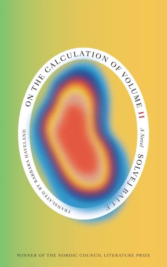
Cover design by Matt Dorfman
